

Client
Italian Ministry of the Cultural Heritage
Year
2016
Team
K-city
Tasks
Data visualization, prototyping, front-end development
Atlas of the outskirts
The atlas, commissioned by the Italian Ministry of the Cultural Heritage, is a detailed analysis of cultural, commercial, social and environmental facilities in the outskirts of 9 major cities.
Goals
The atlas is a print report delivered to the Italian Ministry of the Cultural Heritage. The project goals were:
1. Enable researchers to explore a very large set of data in order to classify different types of outskirts.
2. Enable politicians, administrators and stakeholders to plan actions on the territory.
Solution
A set of tools (interactive and static) targeted on researchers, enabling them to visualize distribution and density of a set of analyzed variables, to highlight sections of the territory with similar attributes, to map all the facilities associated to each section.
A set of visualizations targeted to politicians, administrators and stakeholders, showing in a simple way the outcomes of the analysis, displaying the distribution of the outskirt areas and of the different types of outskirts, and highlighting the key critical factors for a selection of areas.
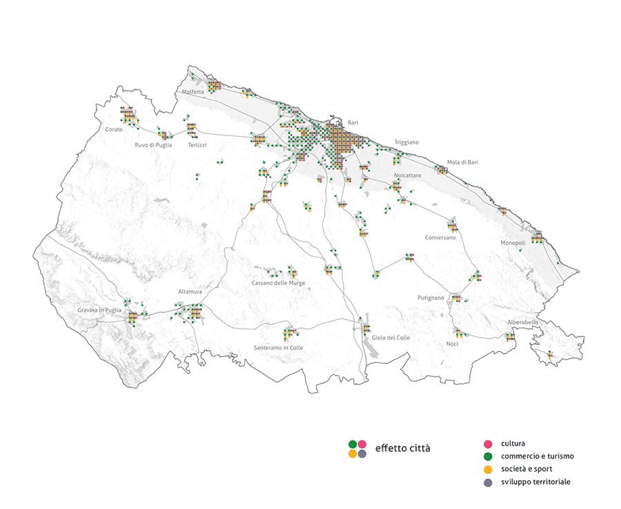
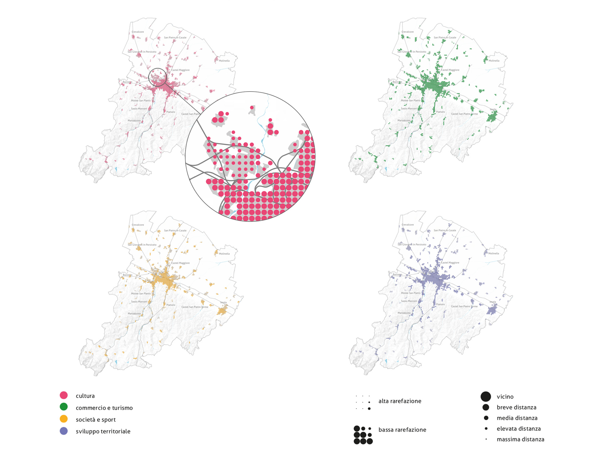
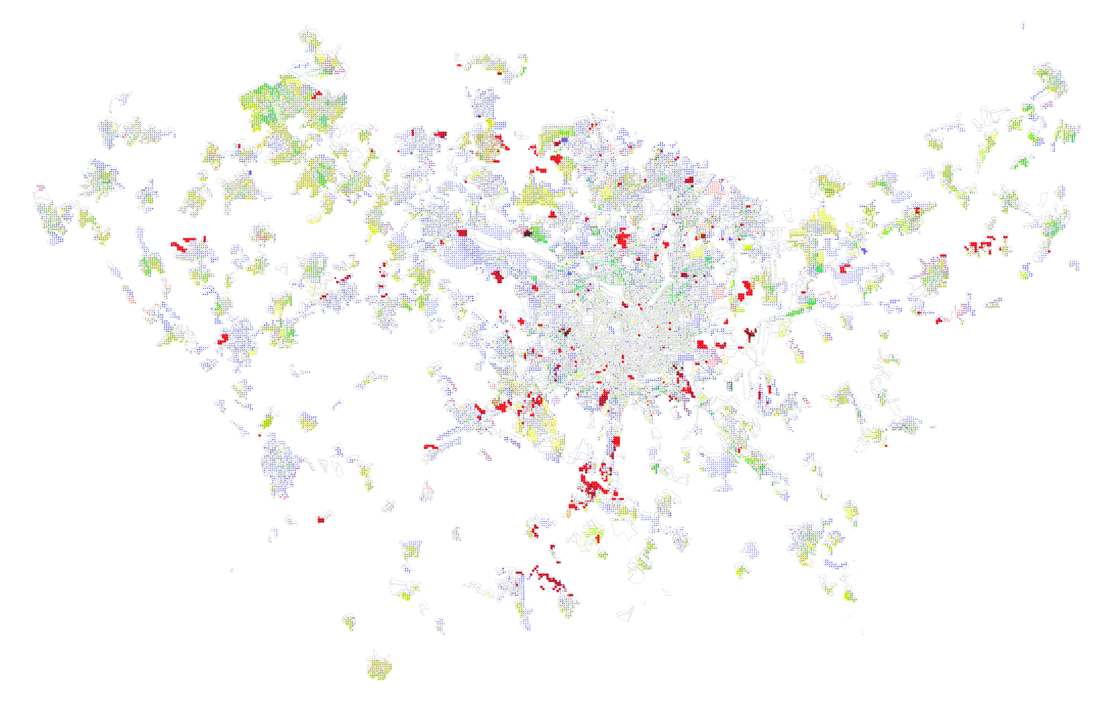
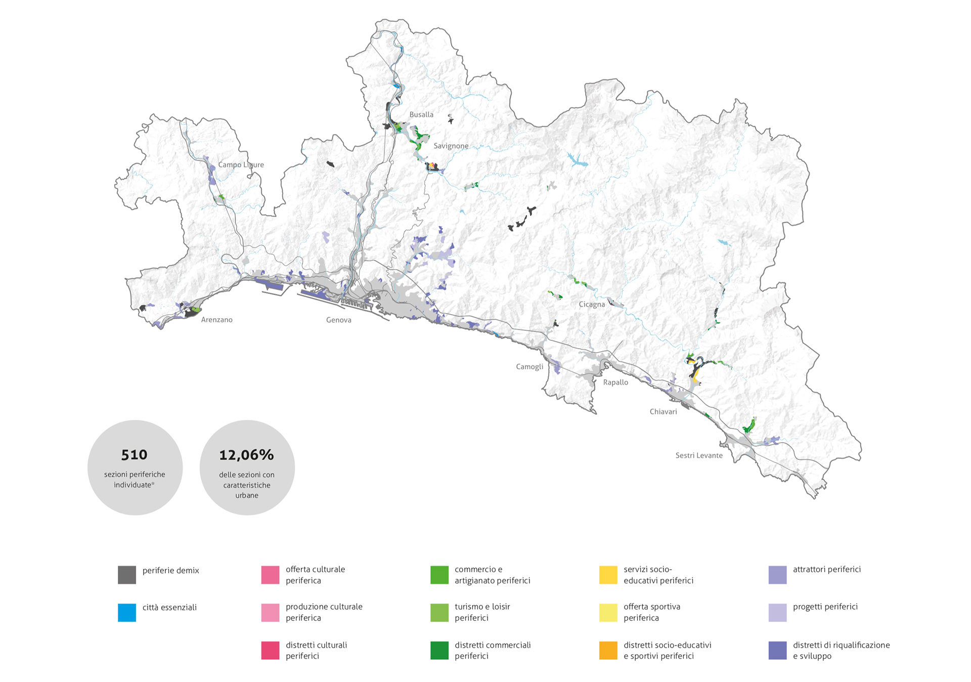
The core of the project is to identify different typologies of outskirts and map them on the territory on the basis of the magnitude and mix of cultural (magenta), commercial (green), social (orange) and environmental (lilac) facilities.
Each city has been divided into very small chunks (census areas), and for each of these the value of more than 30 indicators has been calculated. The indicators describe the degree of availability of cultural, commercial, social and environmental facilities: the greater the indicator value, the farther the related facility.
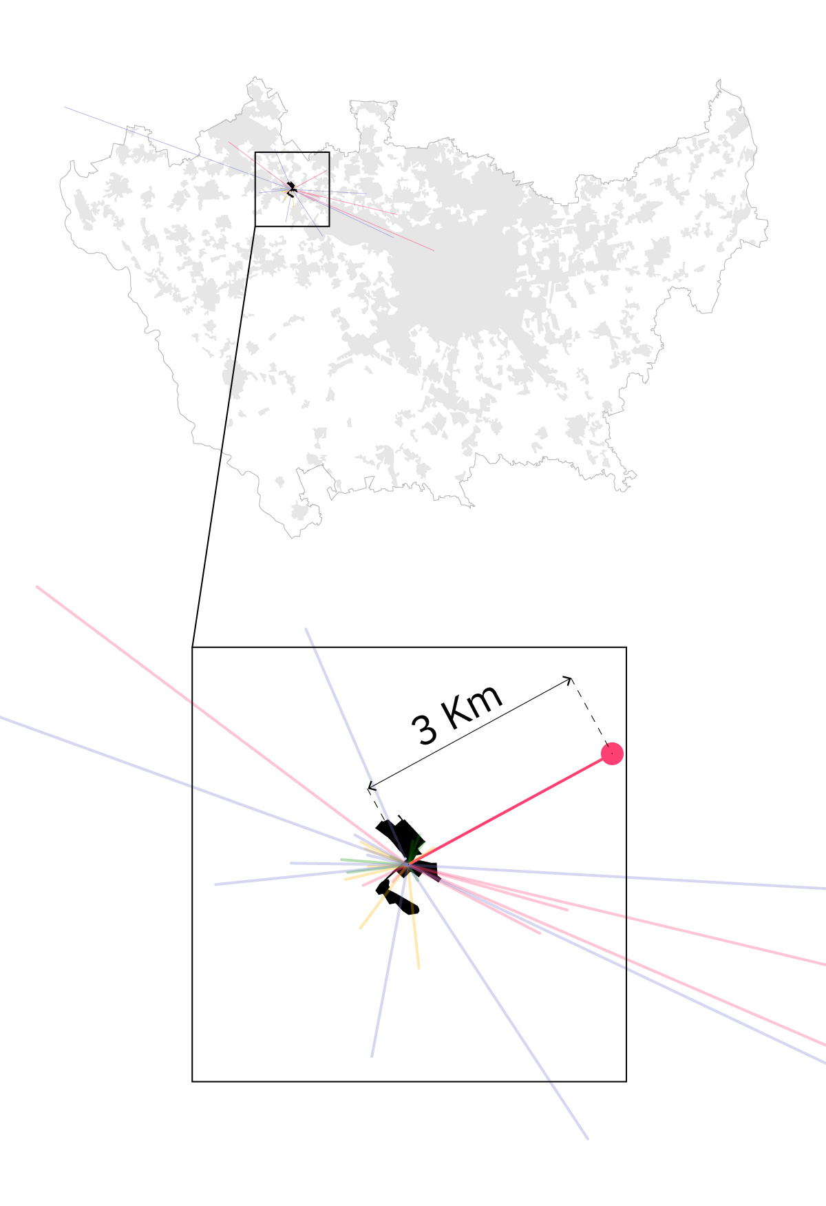
The following example shows a census area called Nerviano (black polygon), belonging to Milano region. The land filled in lightgrey represent the urban portion of the territory.
For each indicator, the distance of the closest related facility reports the level of accessibility of that particular service: in this case, for example, the closest museum (magenta > culture) is 3Km far.
Aggregating and averaging the information related to groups of indicators it is possible to evaluate how culture, commerce, social and environmental activities are distributed on the territory.
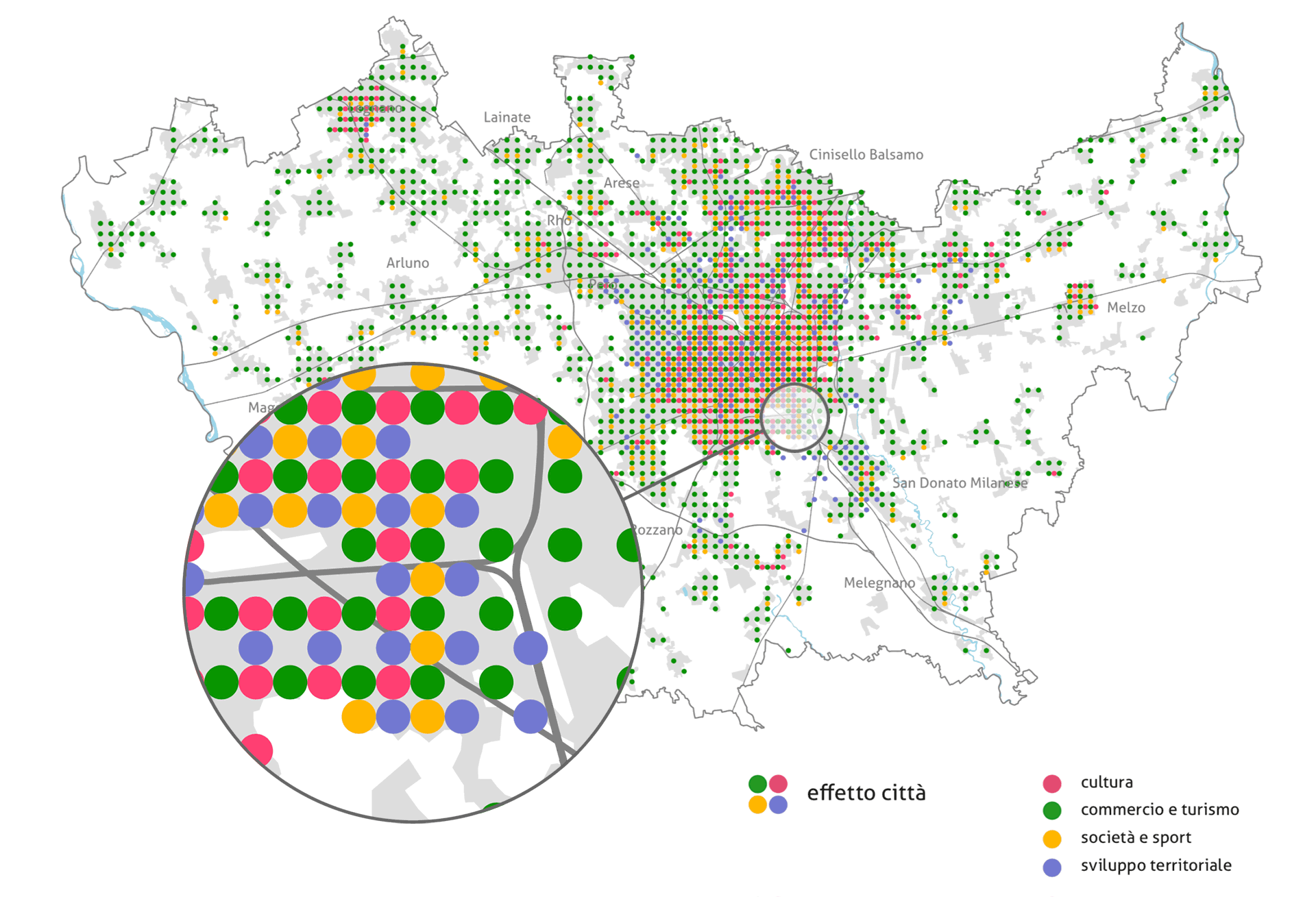
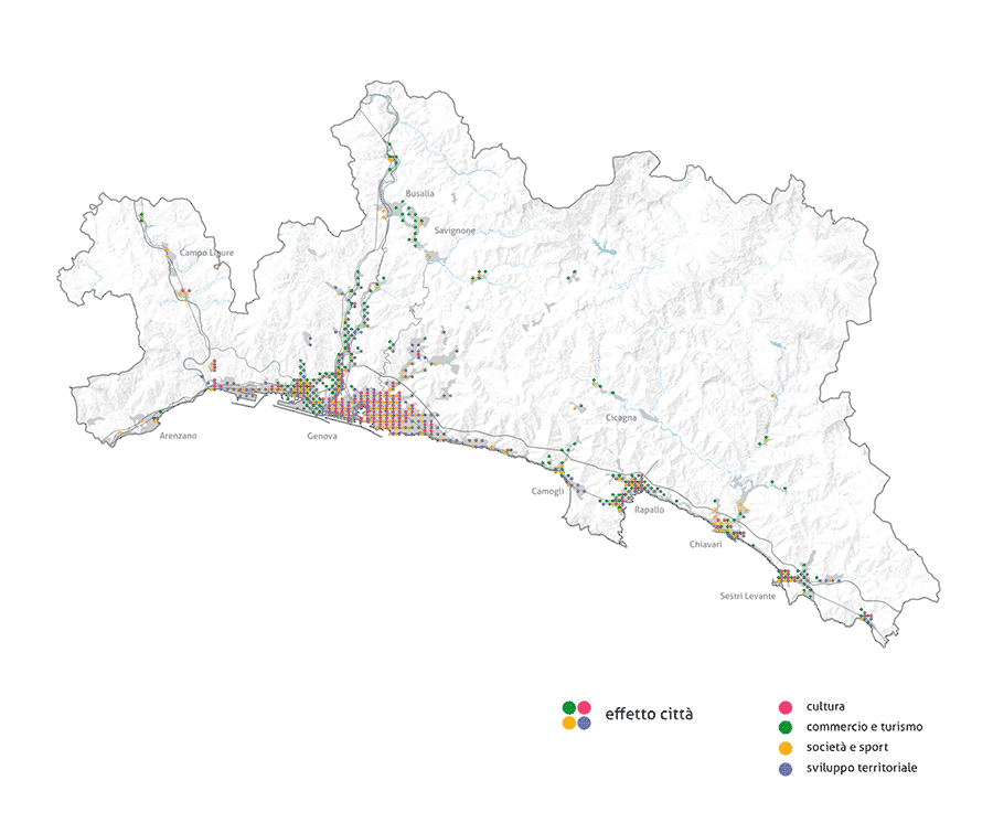
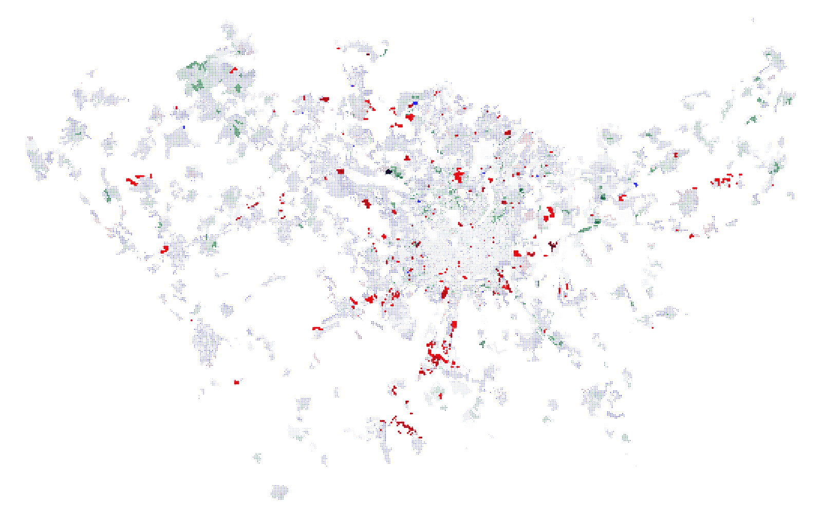
For each city I developed a series of dot maps describing the nature and the density of cultural, commercial, social and territorial facilities
I developed a global view gathering all four variables and showing them only when easily available, and a split view (one map for each variable) showing the levels of the availability.
In the global view, where all the four variables are easily available (4-colour dot pack) we have the so called “city effect”: all kind of facilities are present and close. In all the other cases the area is classified as outskirt.
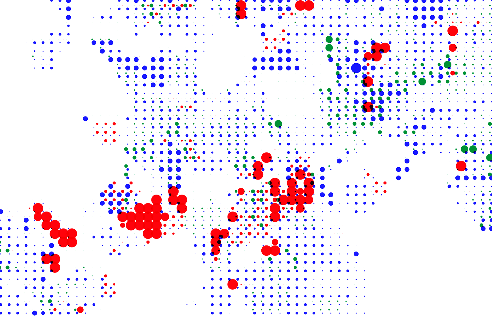
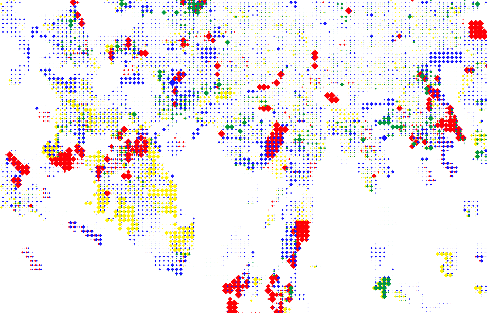
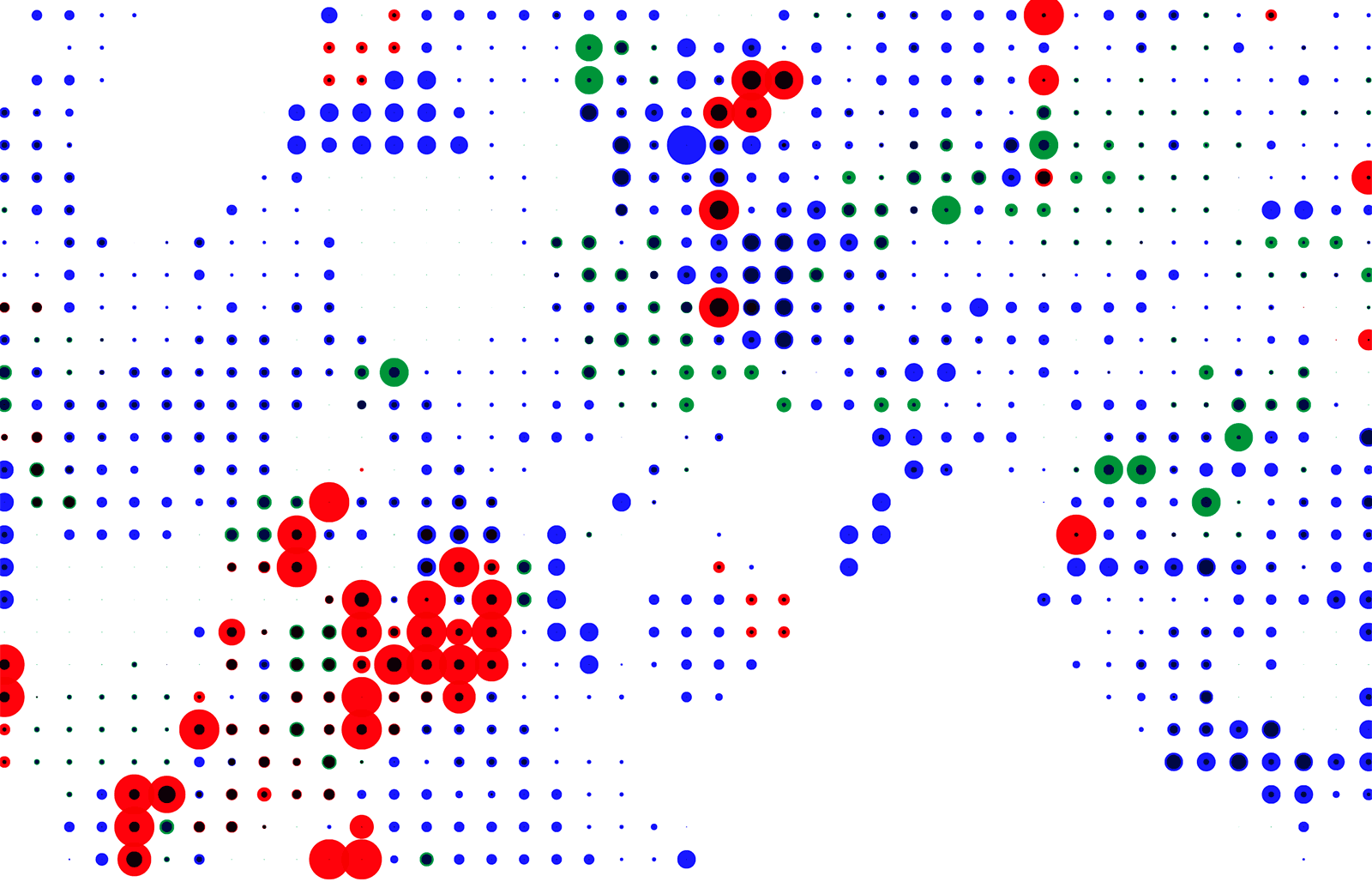
Preliminary explorations with different representations
of many variables on the map. Overlay is interesting but more difficult to read.
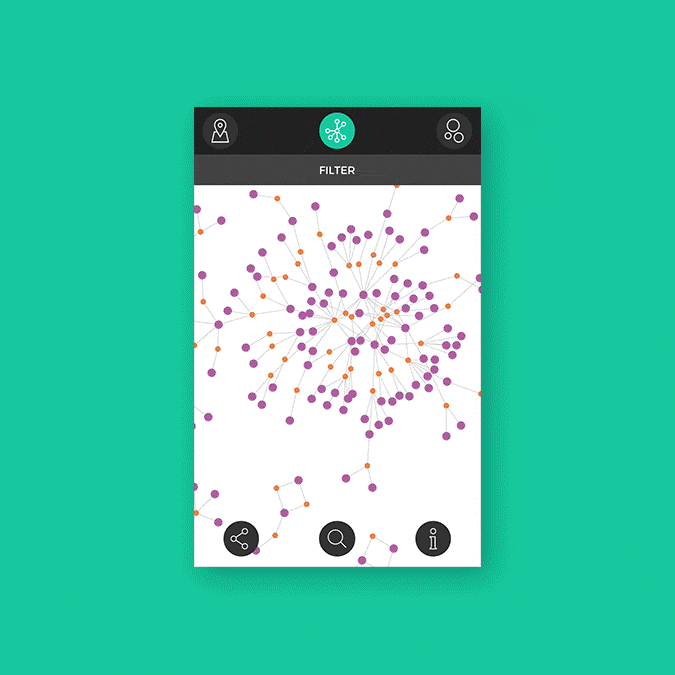
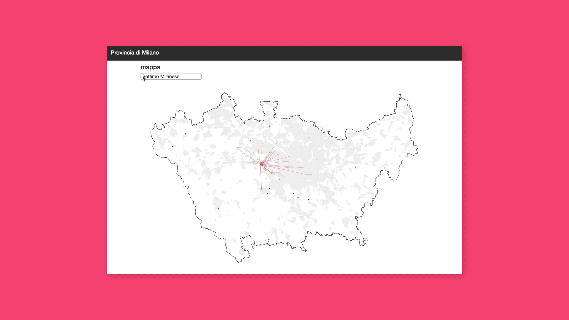
Outskirt areas differ because each one lacks specific kind of facilities, thus different types of outskirt could be identified. I developed a web interactive tool enabling researchers to filter census areas based on the degree of availability of the variables: the barcharts acts as indicators and selectors at the same time.
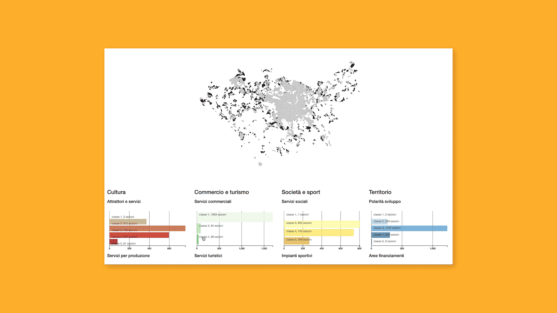
14 different outskirt types were extracted: I generated a custom color palette and a dedicated set of icons to represent all types and map them on the territory.

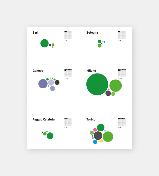
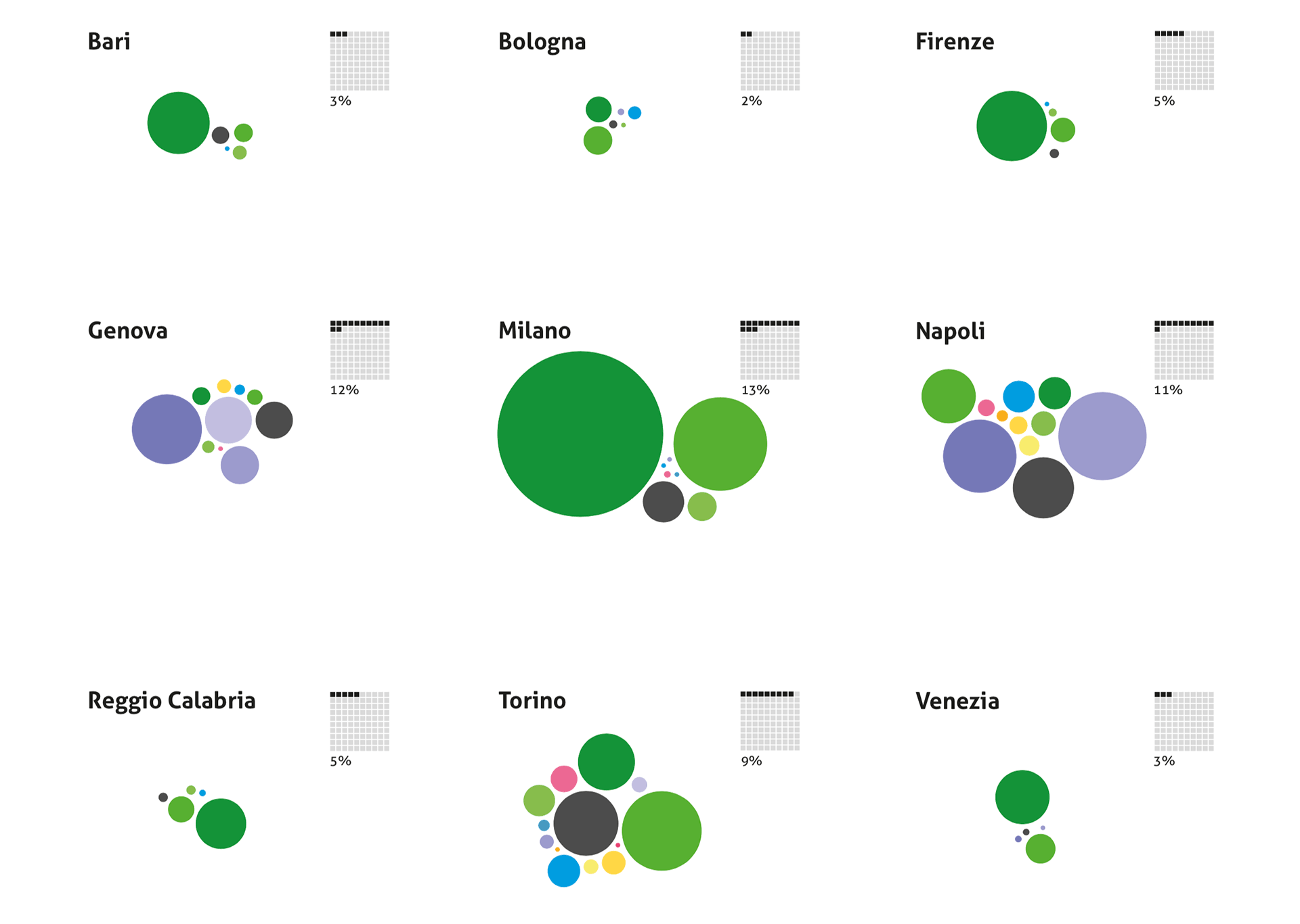
Representing in a clustered bubble chart the relative weight of each outskirt typology for all the 9 cities, the different characteristics of each city emerge: for example the most frequent typologies are the ones associated with the presence of commercial facilities (green bubbles), with the exception of Napoli and Genova where environmental types are dominant, Torino and Napoli have the most varied typology mix.
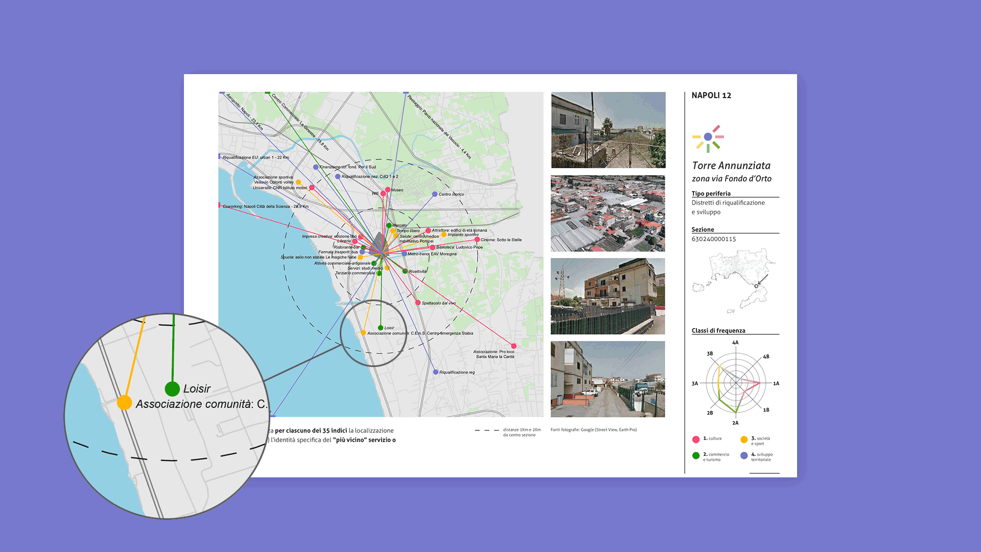
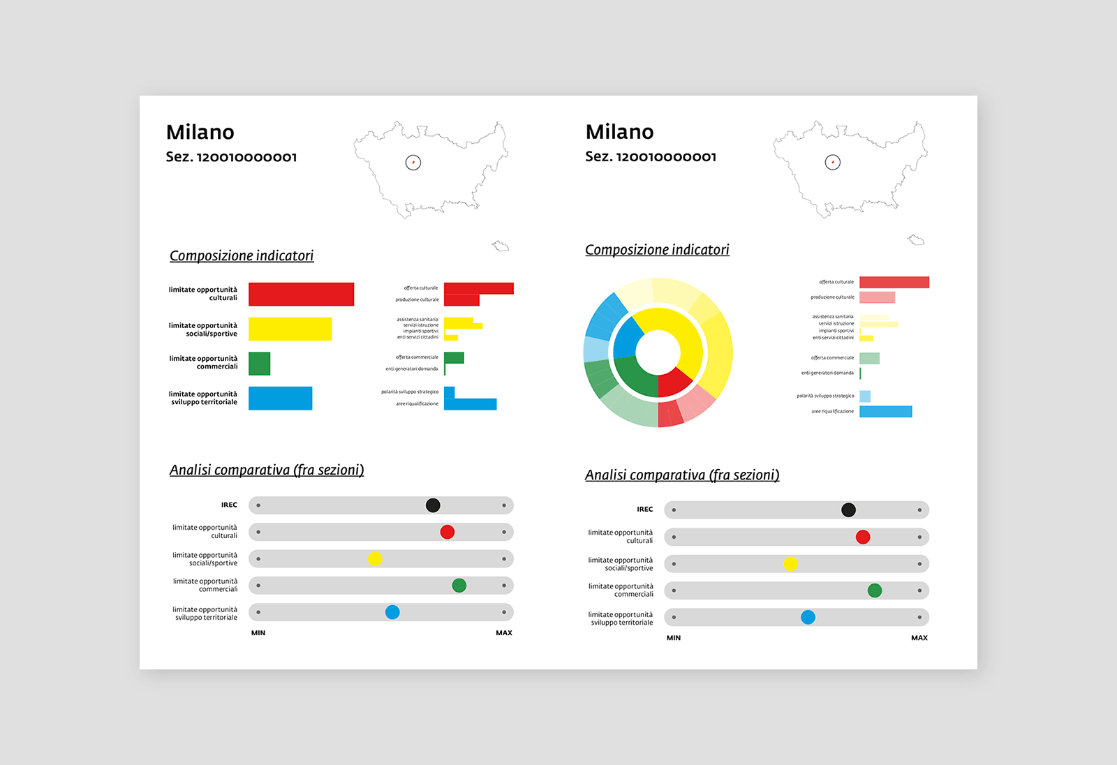
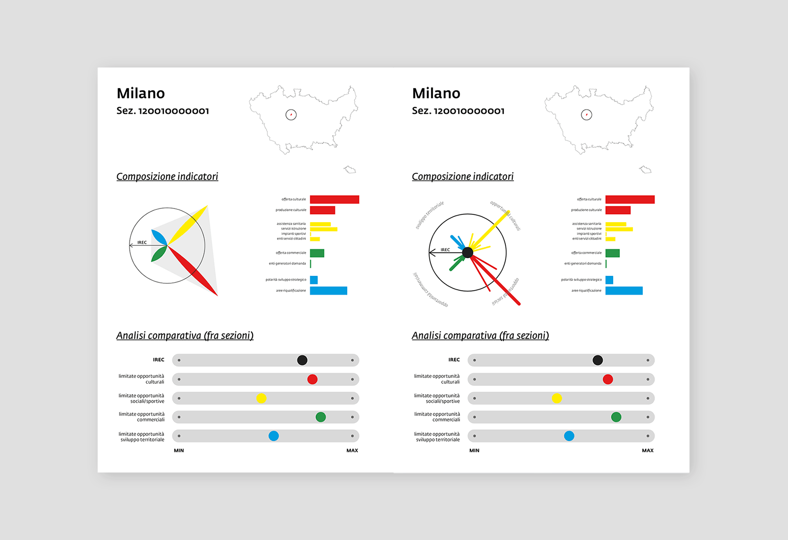
Some specific areas were investigated more in depth: the facilities in or closest to each area are represented one by one on a map, and additional infographics show magnitude and mix of the different variables.
Also in this case I developed an interactive tool which automatically lays out the position of all the facilities for each area.
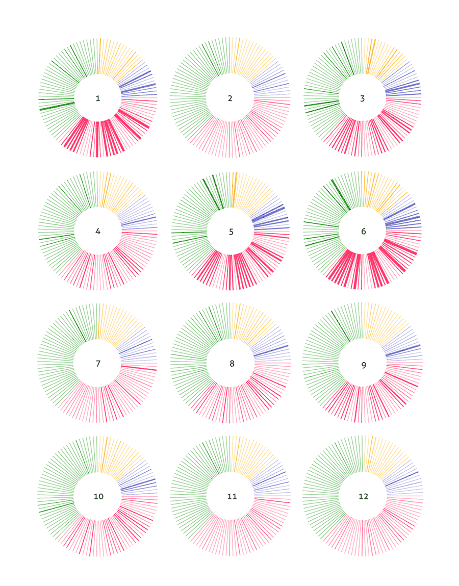
This is a compact way to compare different areas (each donut is an area). Each line of the donut represents an indicator, its thickness being proportional to the indicator’s value. The color is associated to the type of indicator (cultural, commercial, social, environmental). The color density gives information about which type of facilities are most or least available, and a legenda can help to identify which specific services are close or far.
Preliminary explorations with different representations
of many variables on the map. Overlay is interesting but more difficult to read.
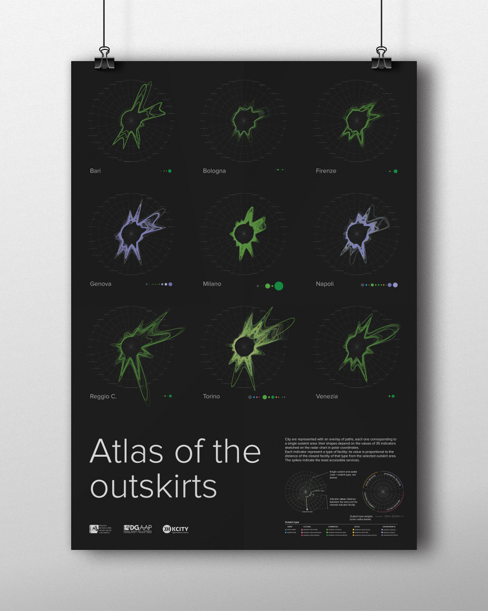
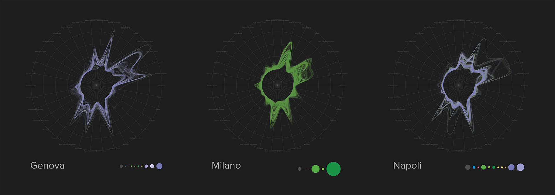
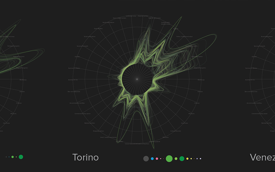
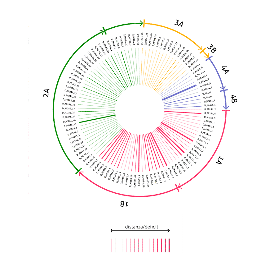
The donut representation triggered a further exploration, carried out as a personal development. Keeping the indicators mapped on a circle, their values can be associated with the lenght of radial segments and then connected by an interpolation curve. Overlaying all the plots of all the census areas a very complex but insightful plot appears: the color blend depicts the outskirt type mix, while the biggest spikes indicate the less available services.
The insight emerges naturally from data: with the help of a well crafted legenda we can easily see the most important outcomes, but at the same time we preserve all the nuances.
Cities are represented with an overlay of paths, each one corresponding to a single outskirt area: their shapes depend on the values of 35 indicators sketched on the radar chart in polar coordinates. Each indicator represent a type of facility: its value is proportional to the distance of the closest facility of that type from the selected outskirt area. The spikes indicate the least accessible services.