Client
Audi
Year
2017
Team
TODO
Tasks
Design lead, data visualization, UX, UI, front-end development
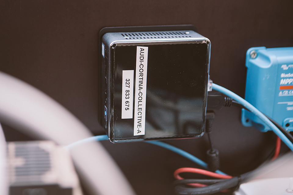
Audi digital points
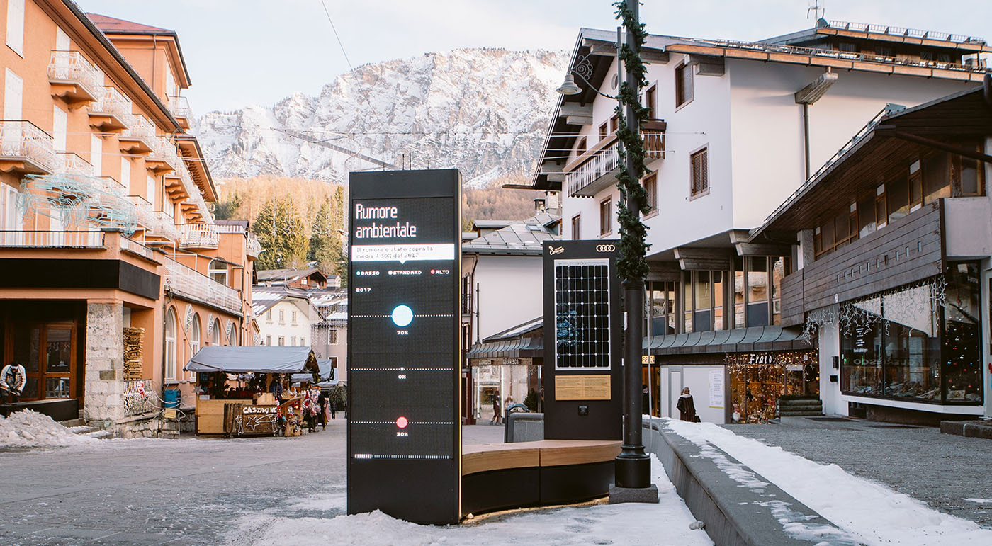
Custom system to collect data and generate real-time infographics to bring awareness about noise pollution, sustainable energy and driving safety.
The six installations are designed to stay in Cortina for four years, until the 2021 World Ski Championship, gradually building their database and showcasing insights, trends and comparisons over time.
Goals
The six installations are designed to stay in Cortina for four years, until the 2021 World Ski Championship. The project goals are:
1. Communicate Audi's committment towards the environment.
2. Promote Cortina as an innovation center, where sustainability and performance will be strongly bound.
3. Raise people awareness about environmental topics.
Solution
6 eye-catching installations about noise pollution, sustainable energy, driving safety and climate variation, showcasing insights, trends and comparisons over time.
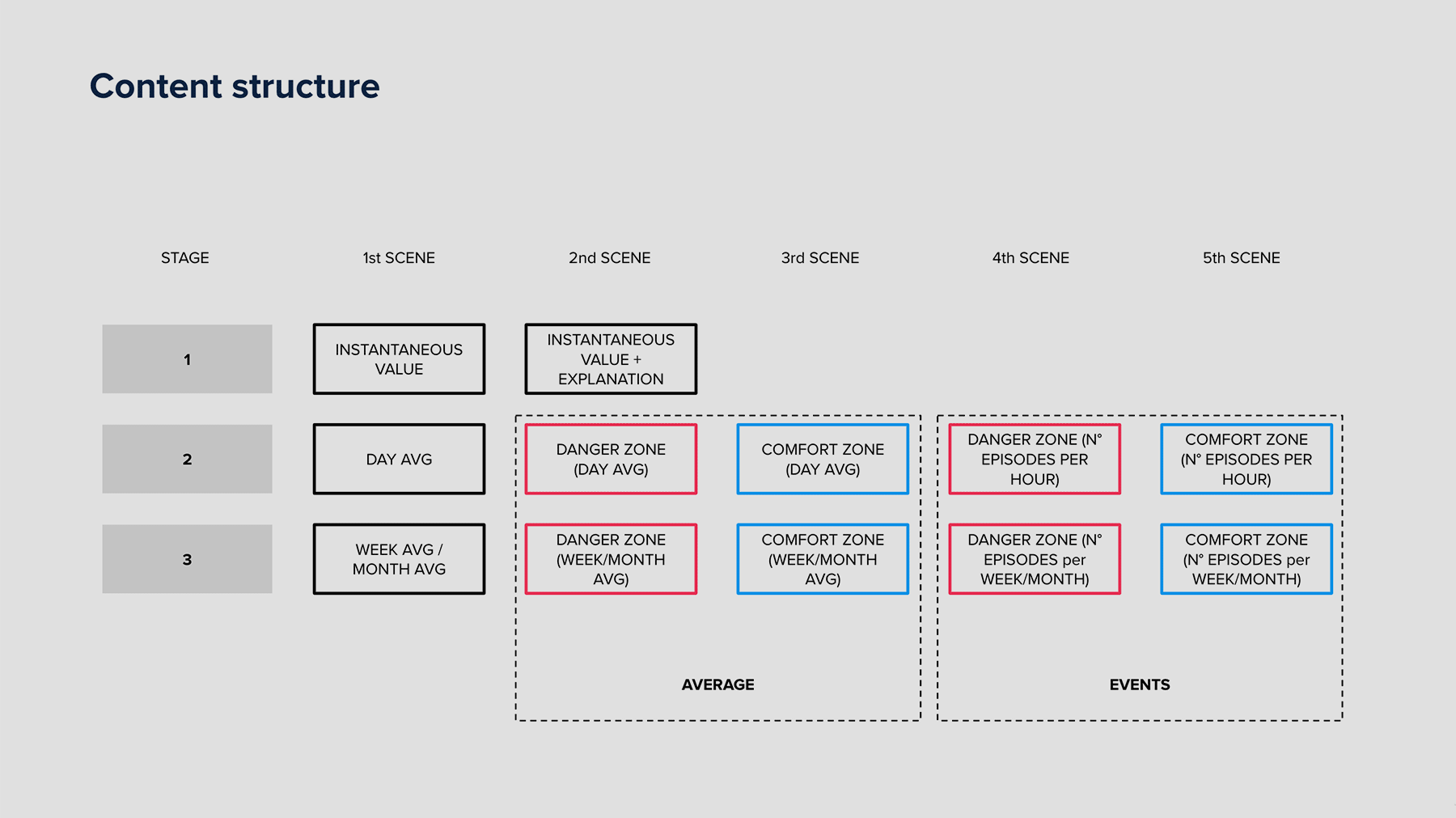
In order to deliver effectively complex topics and lots of data to a generic audience in a low attention context (outdoor, no interactivity) the installations feature real-time eye catching visualizations, a simple narrative structure with self-sufficient scenes, few texts and bold visuals — a mix of illustrations and diagrams. Display all data collected during 4 years, the visualizations grow over time, displaying insights which become more and more interesting as far as time passes by.
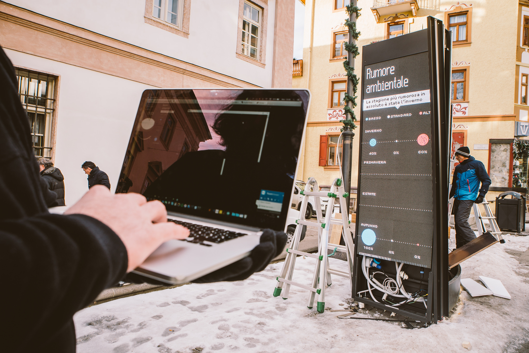
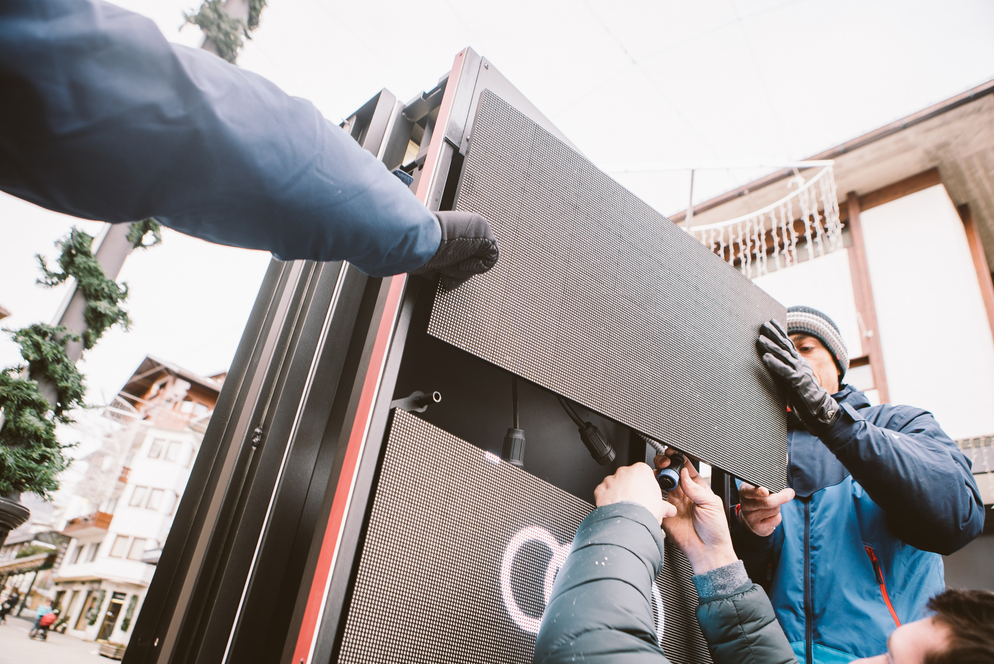
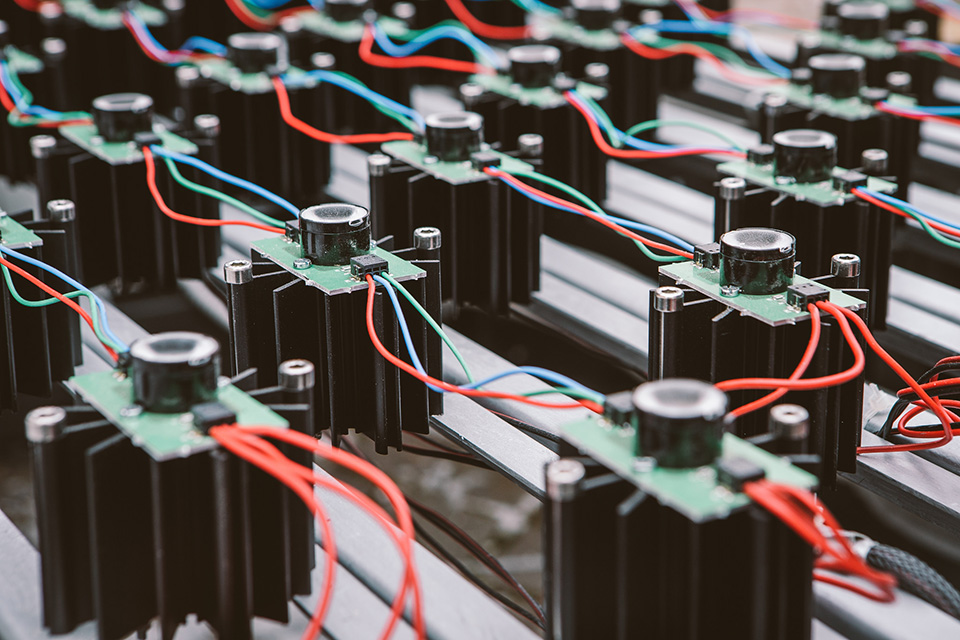
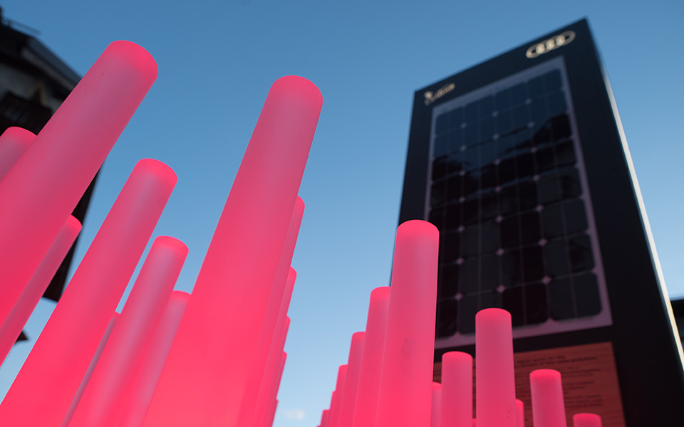
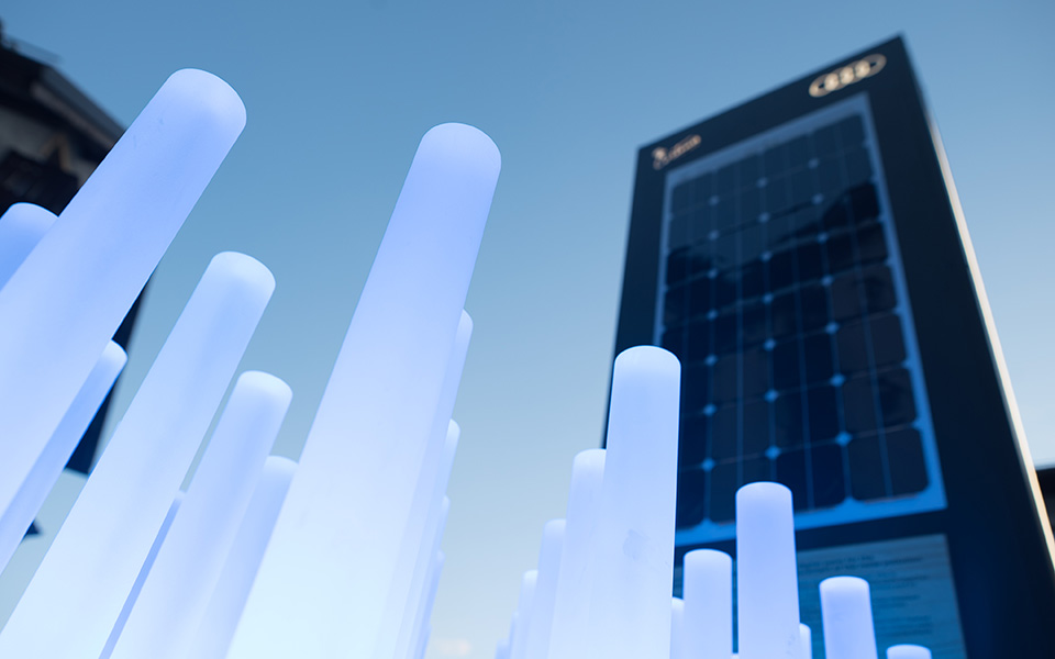
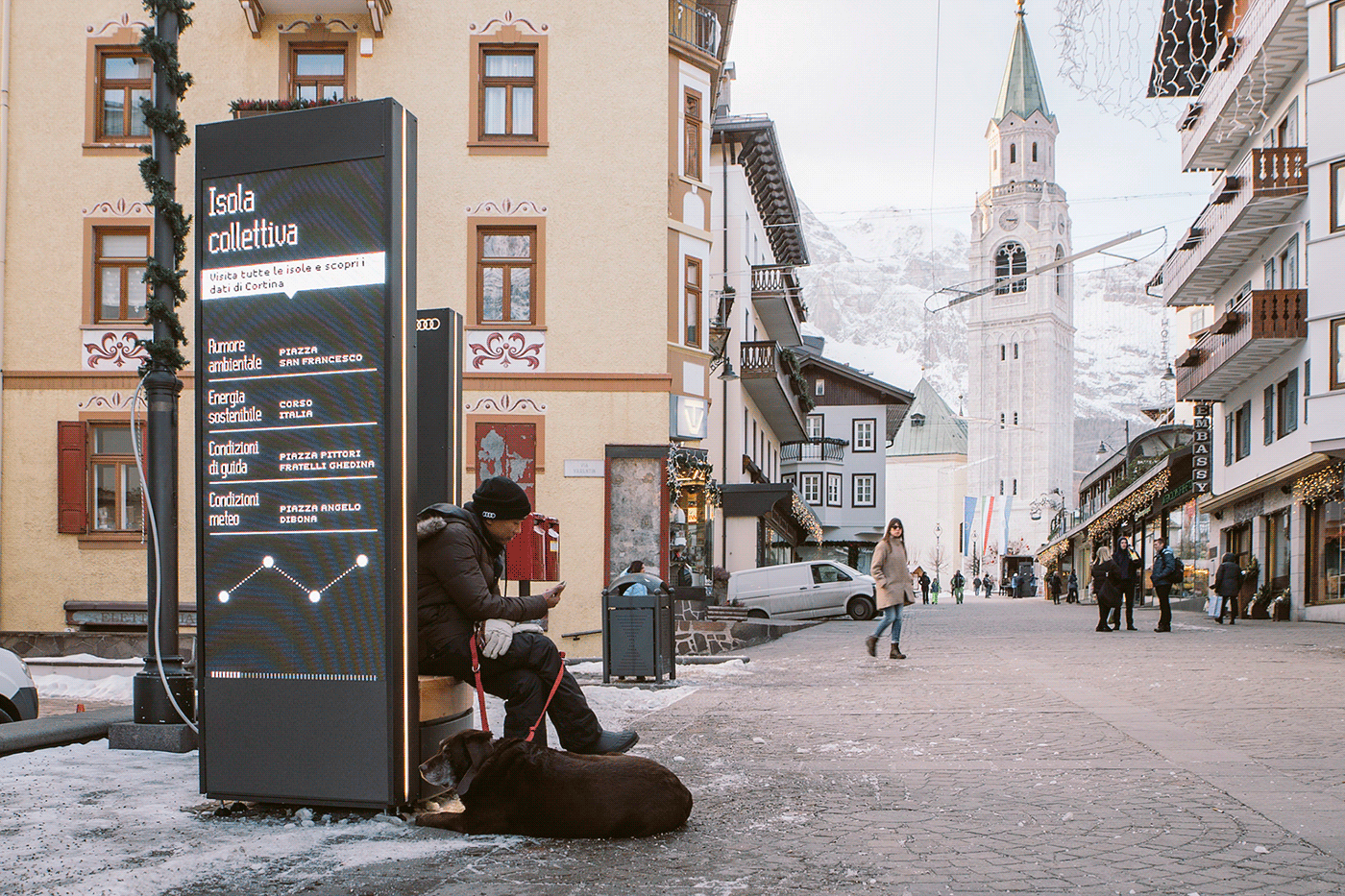
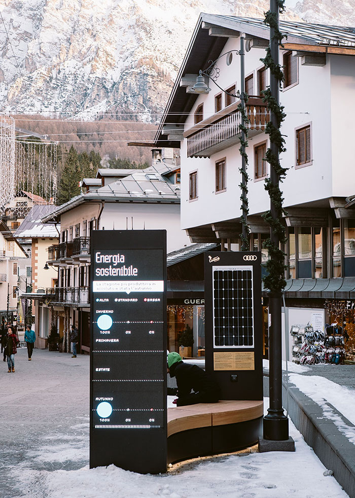
There are 6 different isles, each one consisting in a bench, a led bar matrix and a totem led wall conveying the visuals. 4 single isles feature the main topics (environmental noise, green energy, driving conditions and climate change) while 2 collective isles collect and display all data.
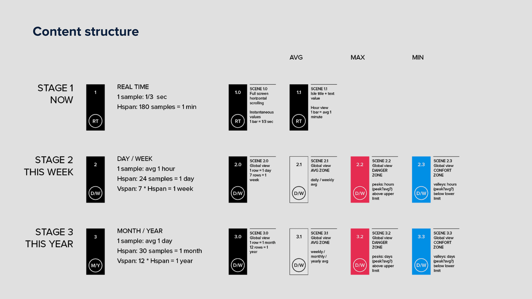
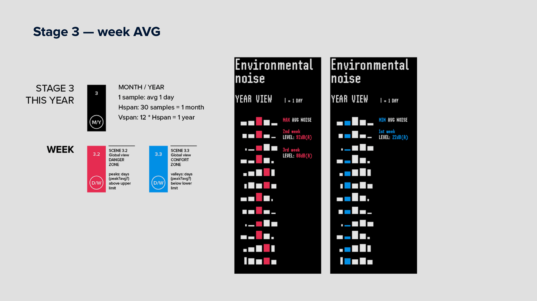
The main narrative is depicted in the user journey below: after a first presentation section (COVER), a HOOK catches people's attention with a real time visualization, while an INFO section puts things in a short time perspective showing daily and weekly data. Finally, a BRAND section connects each isle's topic with the brand.
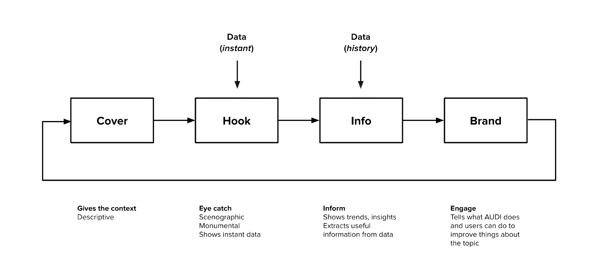
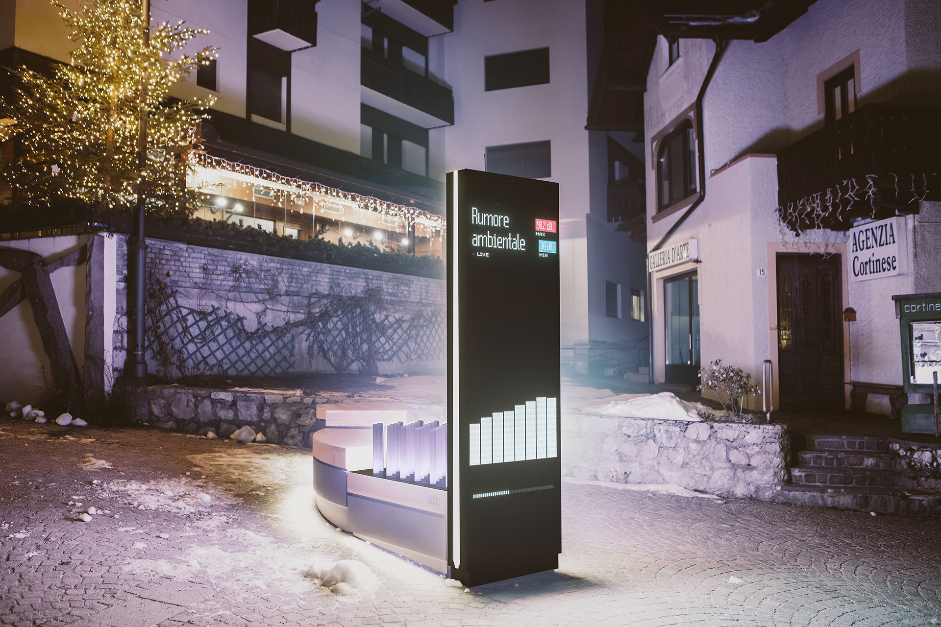
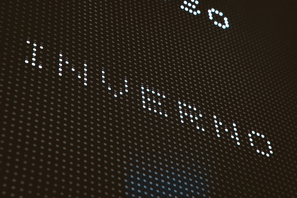
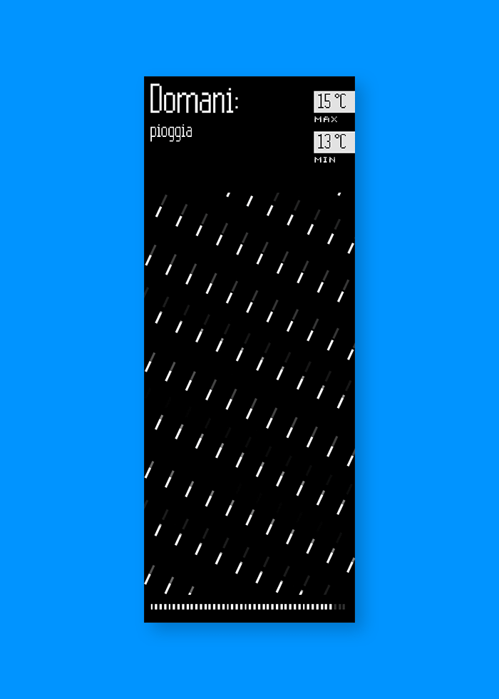
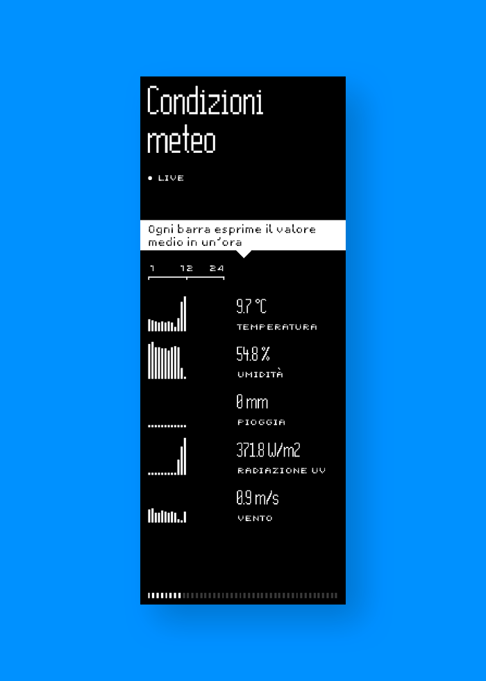
The HOOK section is the main eye-catching moment. On the 4 single isles a full screen real time visualization show the noise level, the energy stored by the solar panel, the visibility and road conditions and the weather forecast. All the visuals are prominent, dynamic and very simple.
The matrix of led bars behind the led walls echoes the instantaneous value of the isle's variable shown on the led wall, using the same three-color palette to classify it.
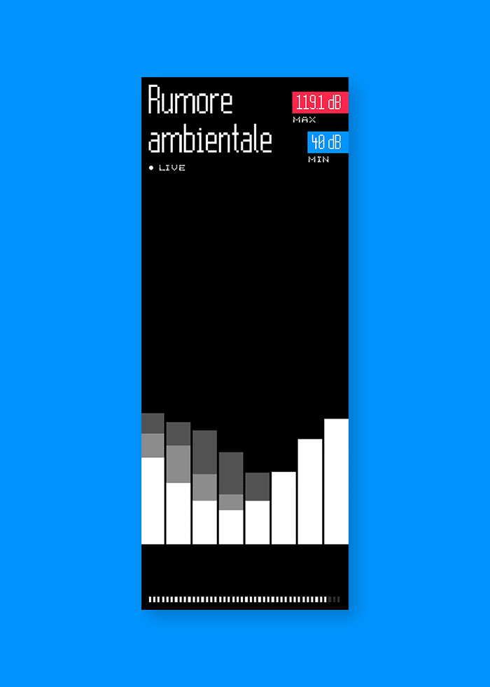
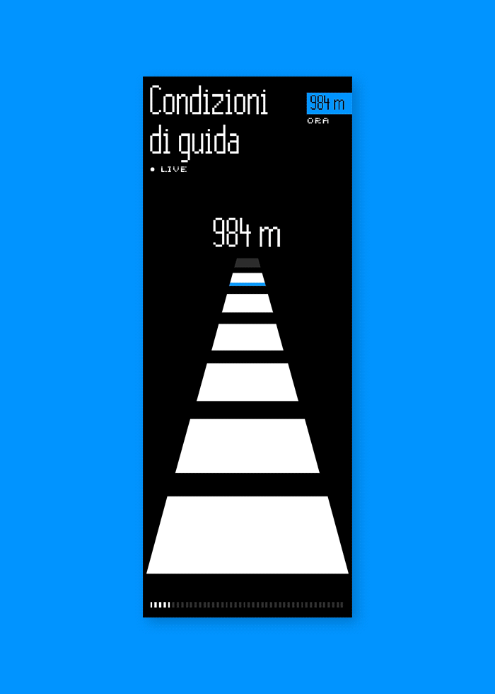
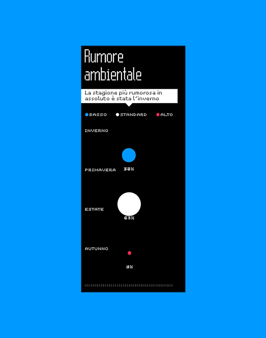
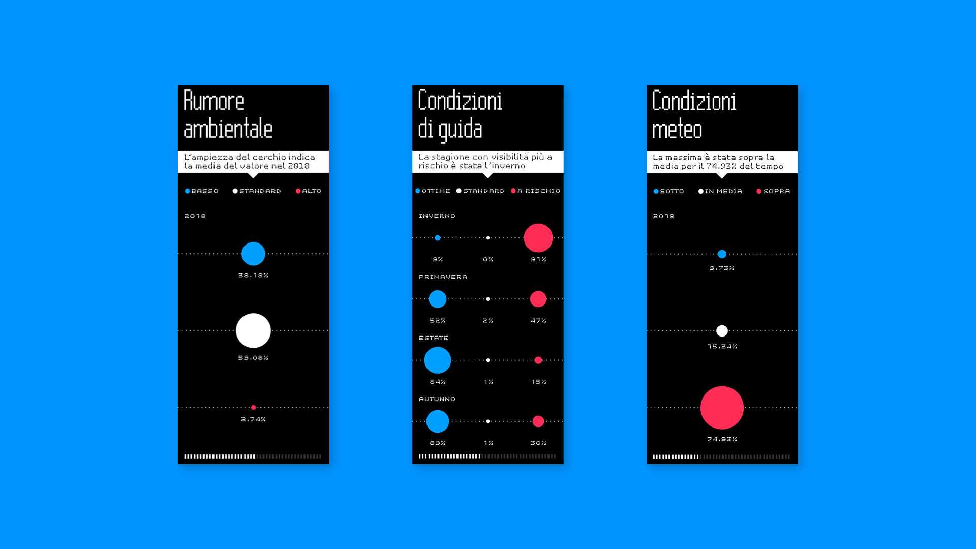
Color codes tell if conditions tend to remain average (white), better then average (blue) or worse (red).
Depending on the type and the time span of the visualizations, the color is able to tell if things are stable, improving or worsening, when they are better or worse, or how much time the conditions have been in the three states.
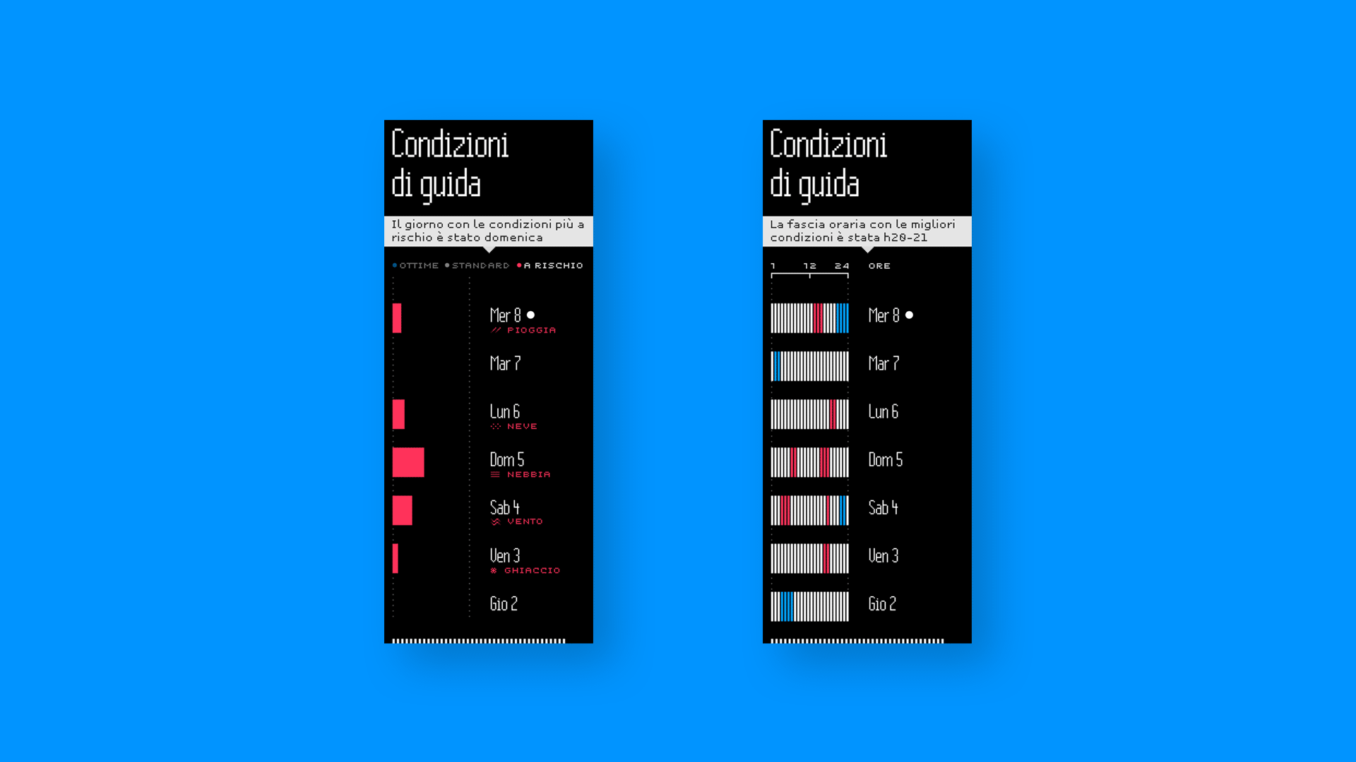
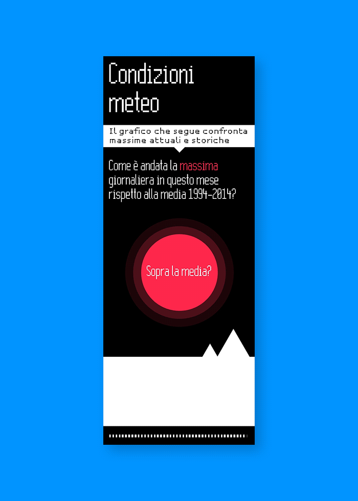
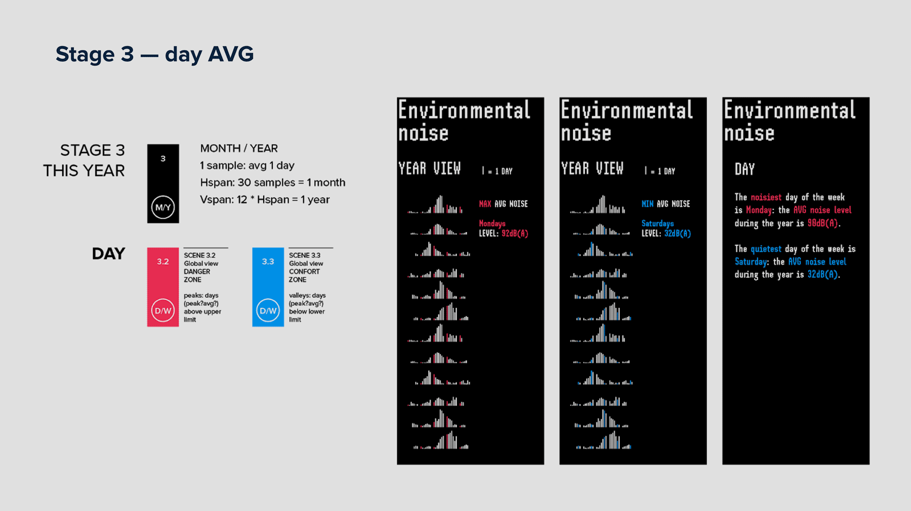
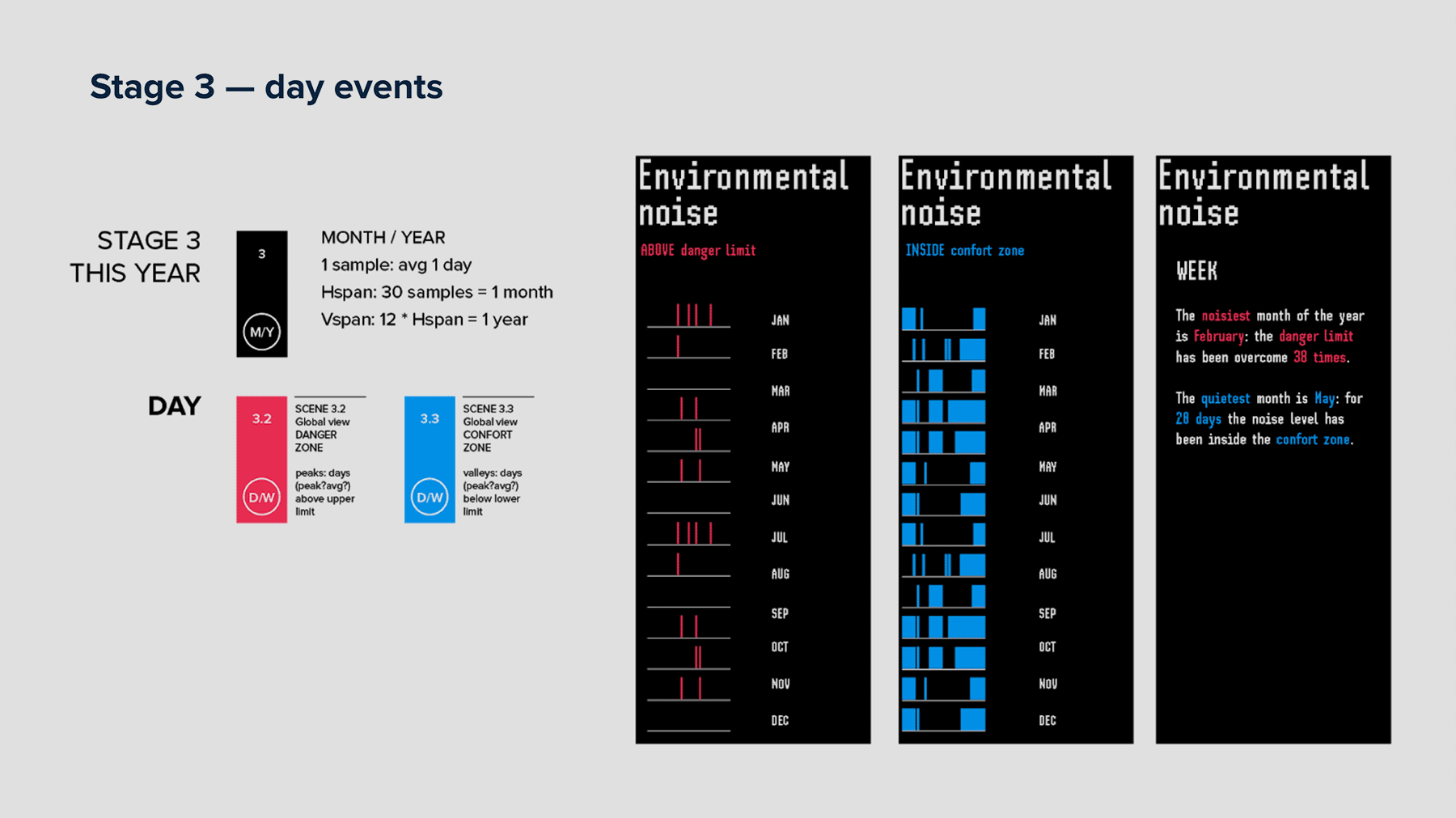
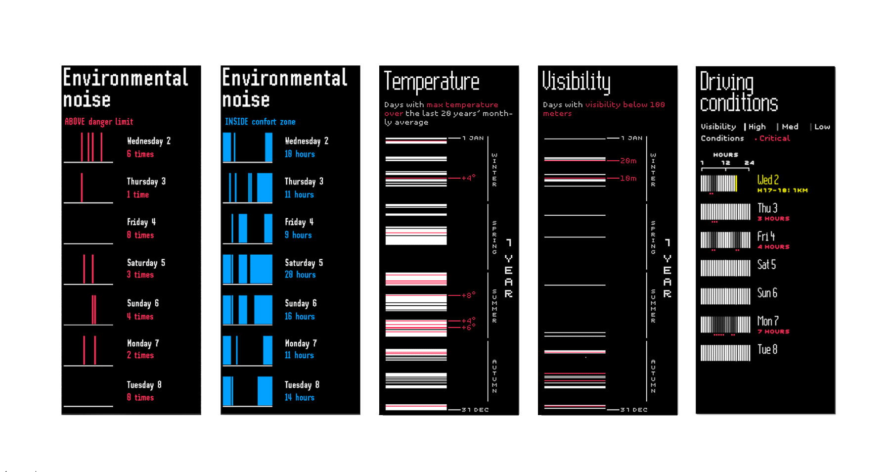
This is particularly useful in the INFO section, where data collected in different time windows are compared: over day and week in the single isles, over season or year in the collective ones. An interesting exception occurs in the weather isle, where the daily temperature average is compared with the montly average taken on the last 25 years, in order to highlight possible increasing or decreasing drifts.
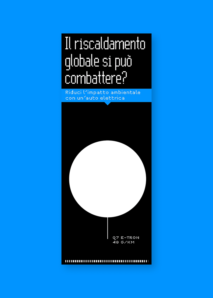
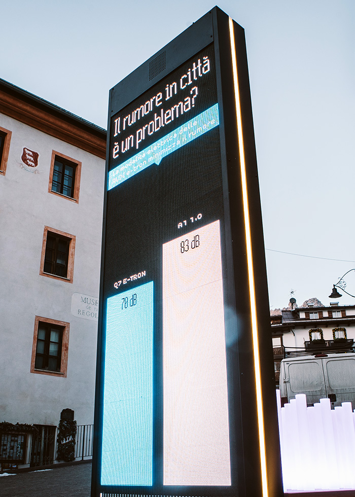
The final section is about the BRAND and shows how Audi tackles each topic, addressing the issues related to it as opportunities to innovate: silent cars, electric traction, hi-tech safety and diagnostic systems will improve the driving experience and decrease the impact on the environment.

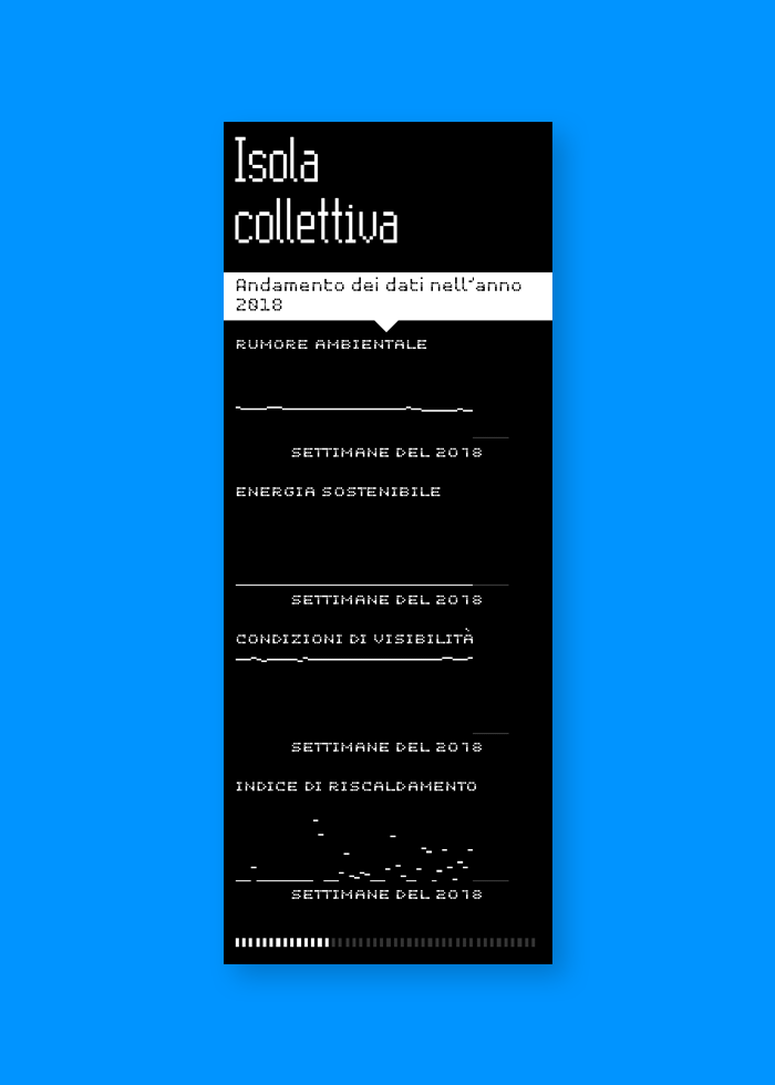
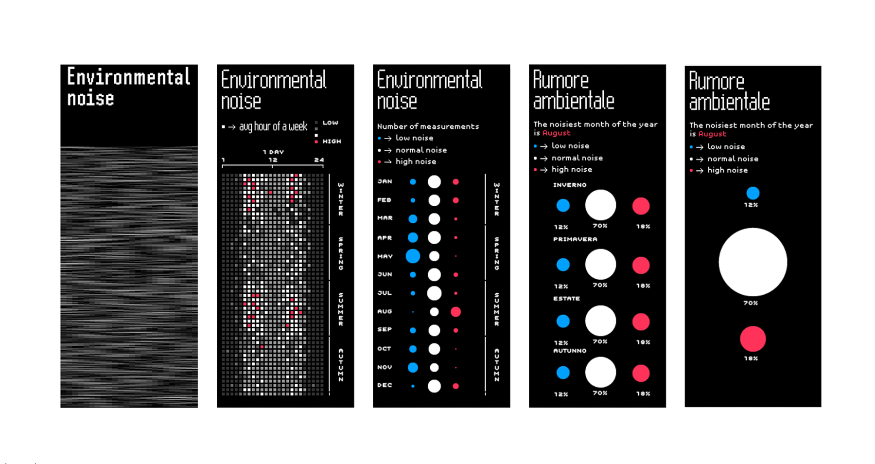
The collective isles collect and display all data in the whole project timespan.
They show how noise, solar energy, driving conditions and temperature change during seasons and years, how much time conditions are standard, better than standard or worse, which season gives the best or the worse performance and try telling something about the trend of each variable.
Results
In December 2018 (one year after the installation) lots of data are available to be displayed on the ledwalls and some insights about the year are emerging. For example, the noise level in Cortina appears to be quite good, resulting worse than standard (above 75dBA) only the 3% of the year. As expected, the noisiest seasons are Summer and Winter, while the quietest is Autumn: during the 45% of the year the level has been better than standard.
Another interesting insight is about the temperature, which was above average (meaning: above the last 25 years average) during the 74% of the year, especially during summer. Only in winter it stayed average 45% of the time, and 38% below.
In the next three years the applications will collect more and more data, generating more insights and reaching the Ski World Championship date with an environmental picture on a 4-year span.
Process
The starting point was a defined installation structure, a set of sensors and a quite generic brief. Analyzing the kind of data that could be extracted from the sensors I started to wonder how to build a story to link these data and the brief, exploring different data acquisition windows and averages and different visualization time spans.
I came up with several interesting windows, ranging from real-time to a whole year and eventually the entire 4-year time span of the project, to show different perspectives: comparing the hours in one day, the days in one week, the seasons in one year, the weeks on four years seemed to be the most promising.
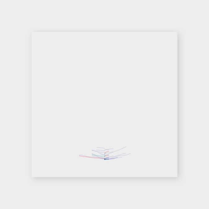
First mockups with different representations of data
using different time units and time spans.
A palette with only three colors has been chosen as the easiest way to mark conditions of good, average and bad (average, above average, below average) in all the topics.
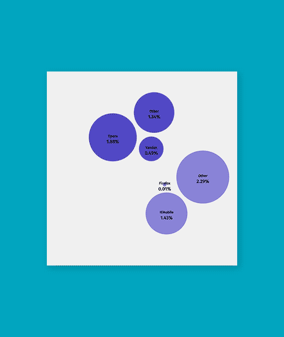
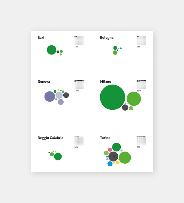
A wide exploration about the kind of visualizations to implement has been carried out, finally choosing the simplest and more straightforward (bar charts, bubble charts) to comply with the context (general audience, low attention, fragmented usage).
Exploration of different data representations
aggregationg data on different time windows.
Pixel perfect visuals, typography and animations have been carefully crafted, in order to be rendered on the led walls in the best way. It was quite tricky to include captions, legends and indications since we had to be really minimal due to the limited space allowed for texts (minimum text body: 5 pixel height).
To do so, several detailed test session have been carried out on a complete led panel we had in our office.
The whole project, from preliminary design to working online application, has been delivered in 2 months by a team of five people: 1 project manager, 2 designers and 2 developers. I worked as team leader, designer and developer.