Client
Fondazione Agnelli
Year
2016
Team
TODO
Tasks
Concept, UX, prototyping, UI
Il futuro è
Concept, format, UX and UI of an interactive web experience built on a series of 150 short interviews with experts in a wide range of fields.
Link to live application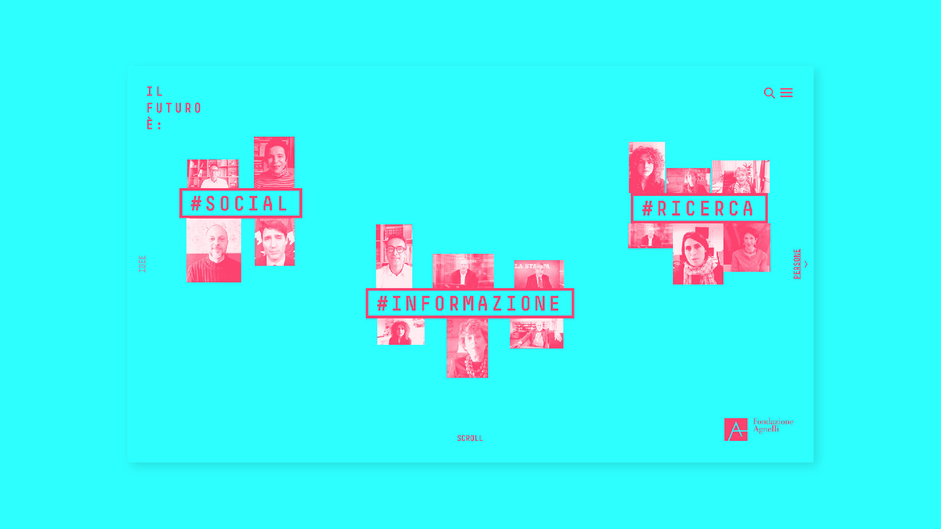
Goals
To mark their 50th anniversary, Fondazione Agnelli wanted to look ahead: what will the future look like, another 50 years from now? The goals of the project were:
1. strengthen Fondazione Agnelli's reputation in the social and educational area.
2. promote Fondazione Agnelli's activities beyond their traditional followers (targeting students and younger people).
Solution
An interactive experience were users can generate custom video interviews following their interests, curiosity and a bit of serendipity. This way of delivering the contents makes the experience more engaging, fostering exploration and mix between topics: this interaction scheme, together with a bold look and feel, could trigger the attention of younger people.
All the interviews have been conducted and recorded with Skype, which means that the video quality is sometimes mediocre and the framing is fixed.
Although we implemented some strategies to live up the experience (different zoom levels, text overlays), watching videos with such characteristics could become boring after a while.
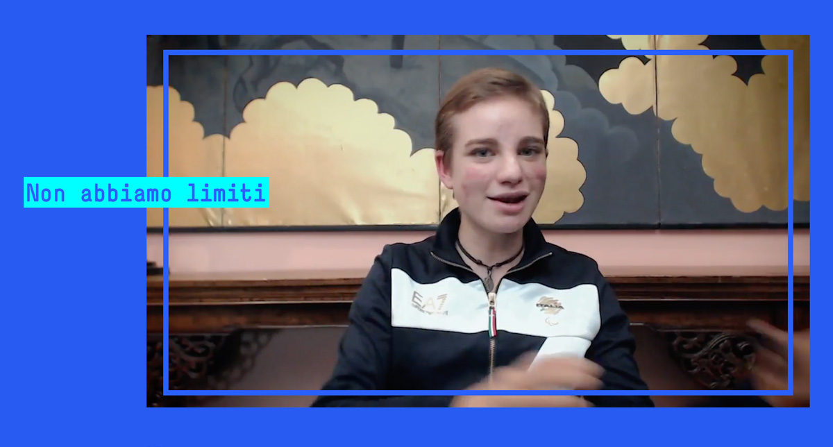
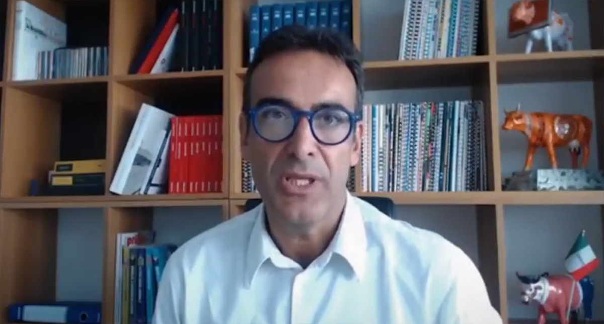
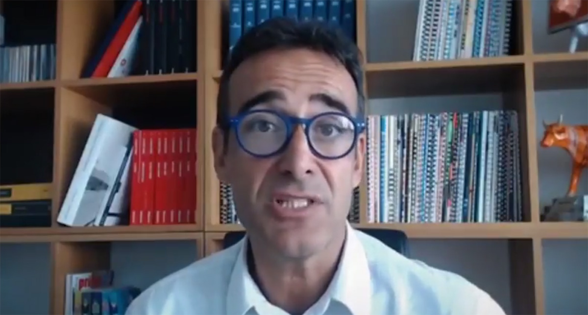
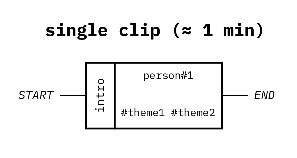
After some testing, we decided to divide each interview in three clips, each one dedicated to a specific question, keeping the maximum duration of a clip around 1 minute.
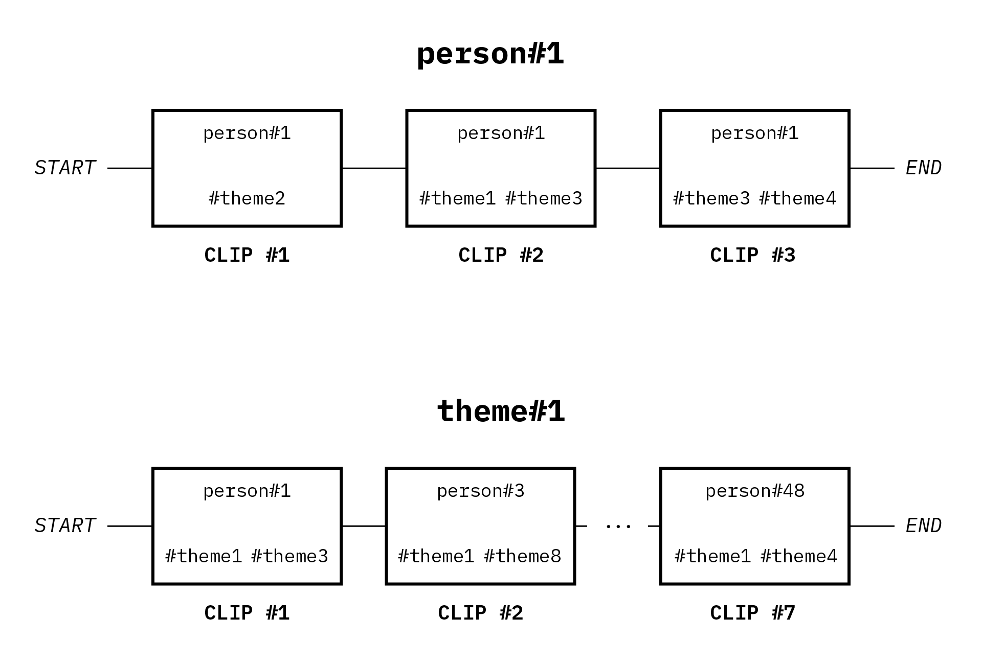
We obtained a total of 150 clips, that can be threaded together along themes or persons to enable multidisciplinary perspectives of exploration.
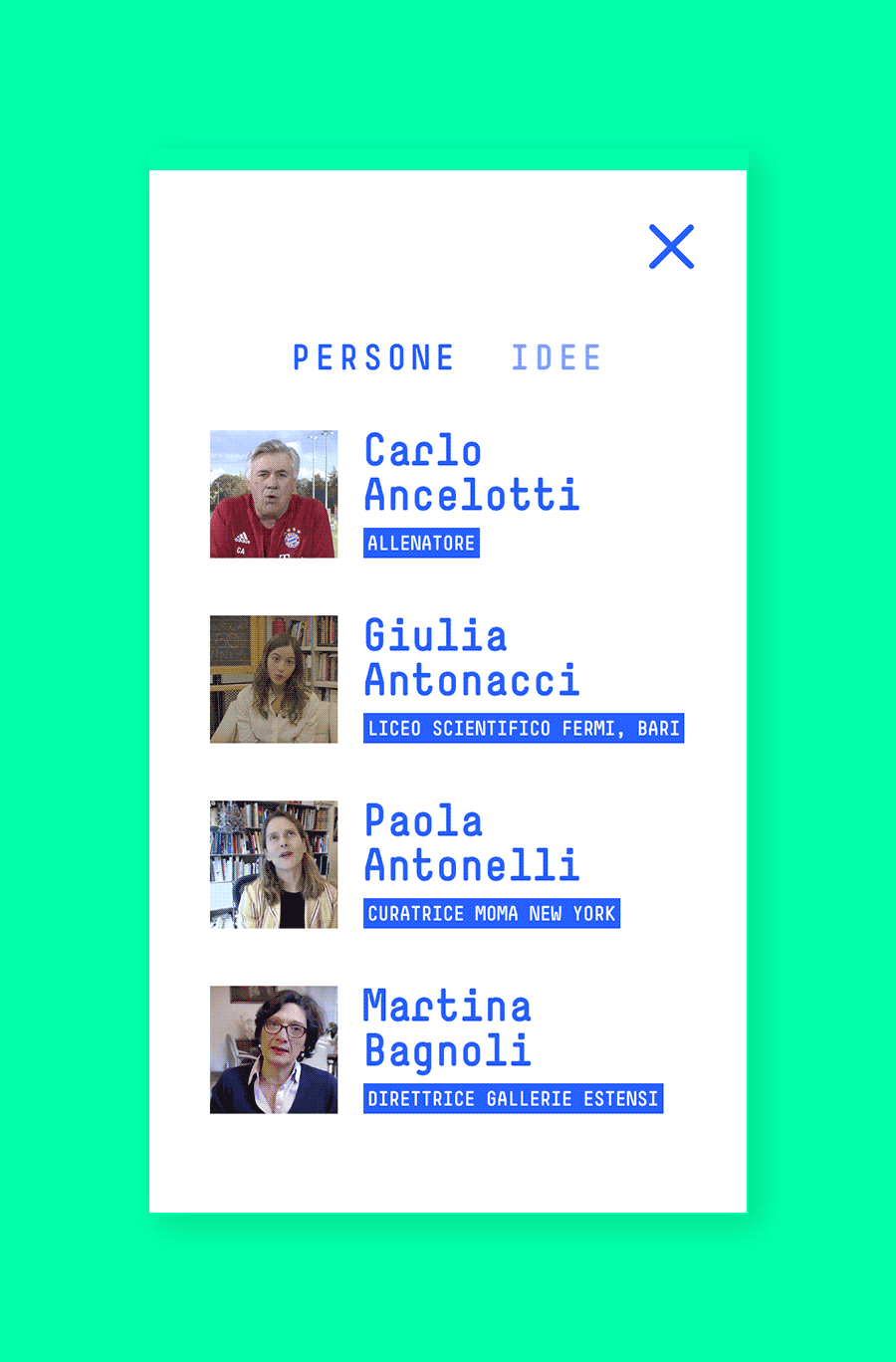
Each single clip is associated to one or more themes. Users can decide to scan clips by person or by theme.
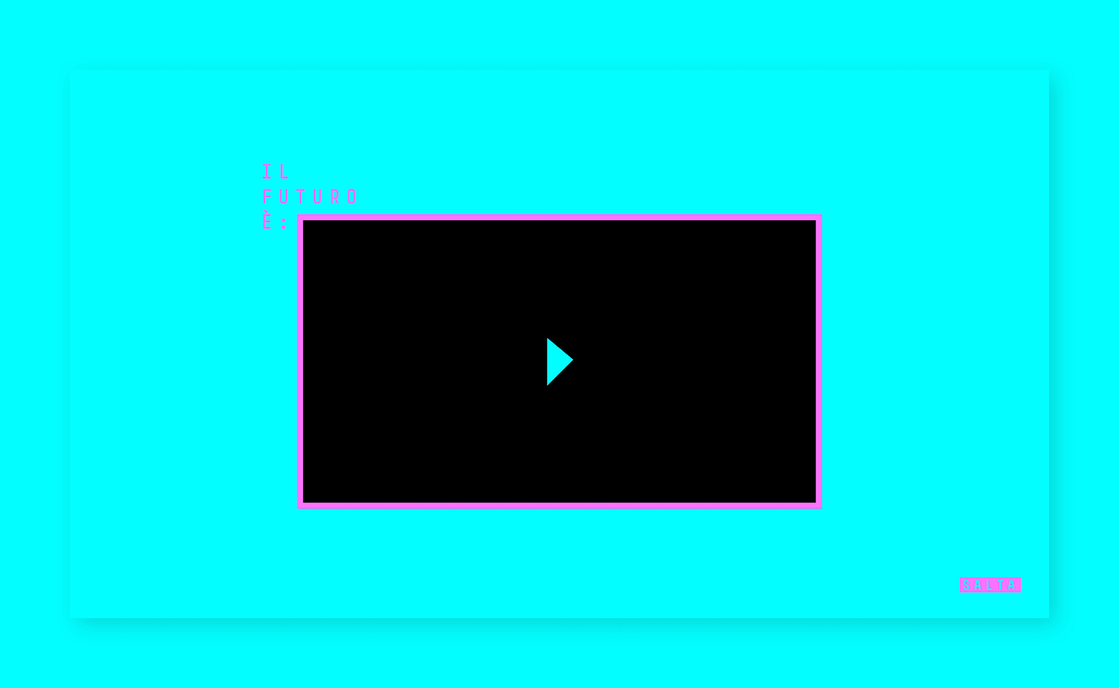
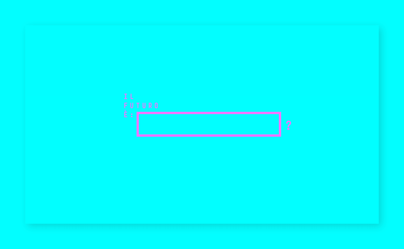
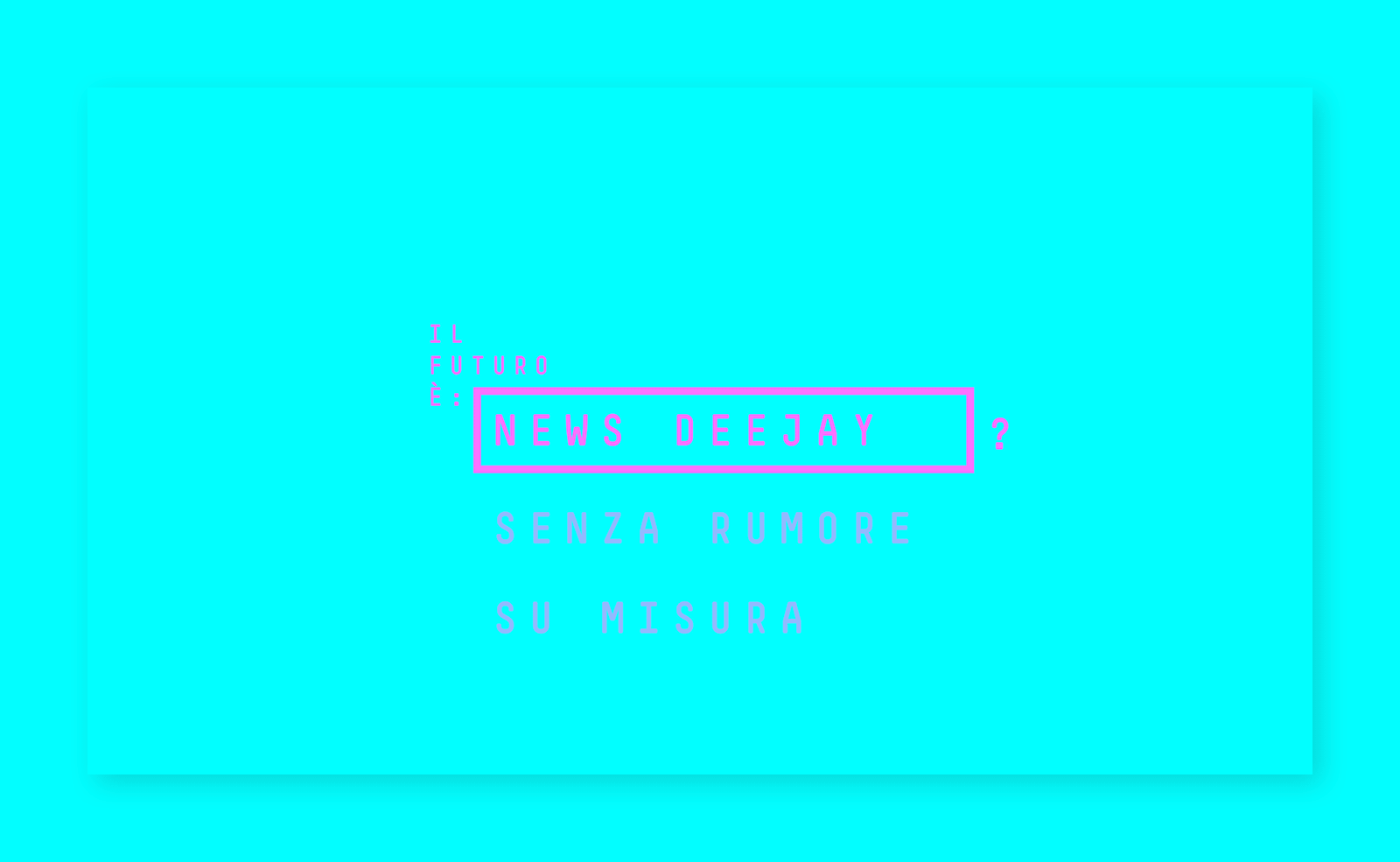
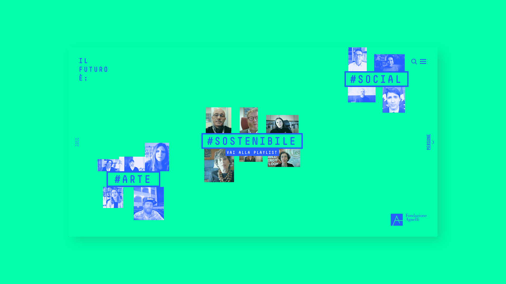
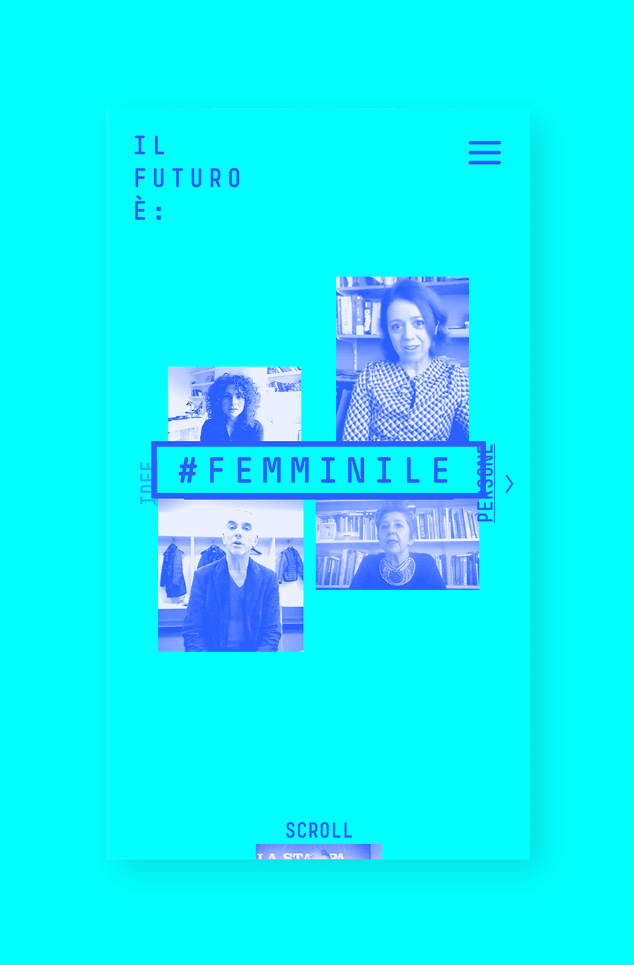
After an onboarding sequence which gives the user the context, the website presents a scrolling wall featuring clusters of thumbnails grouped by themes. The scroll behaviour has been custom developed to give a very smooth and sleek feeling.
Having the clips grouped by theme allows an intuitive exploration and fosters the discovery of correlations between topics; it's also possible a more traditional exploration grouping the clips by person.
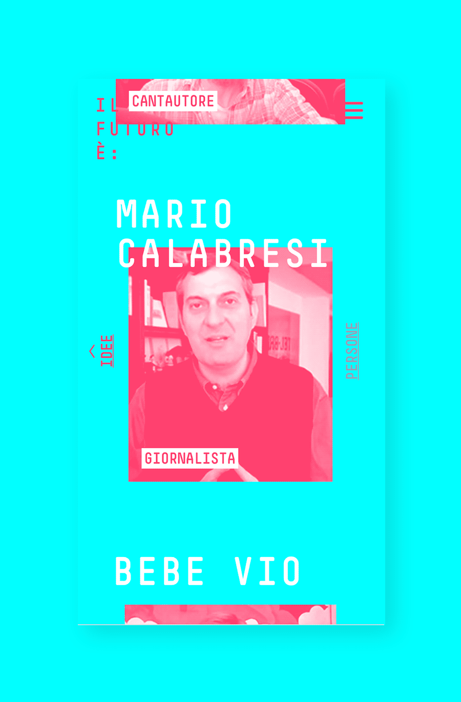
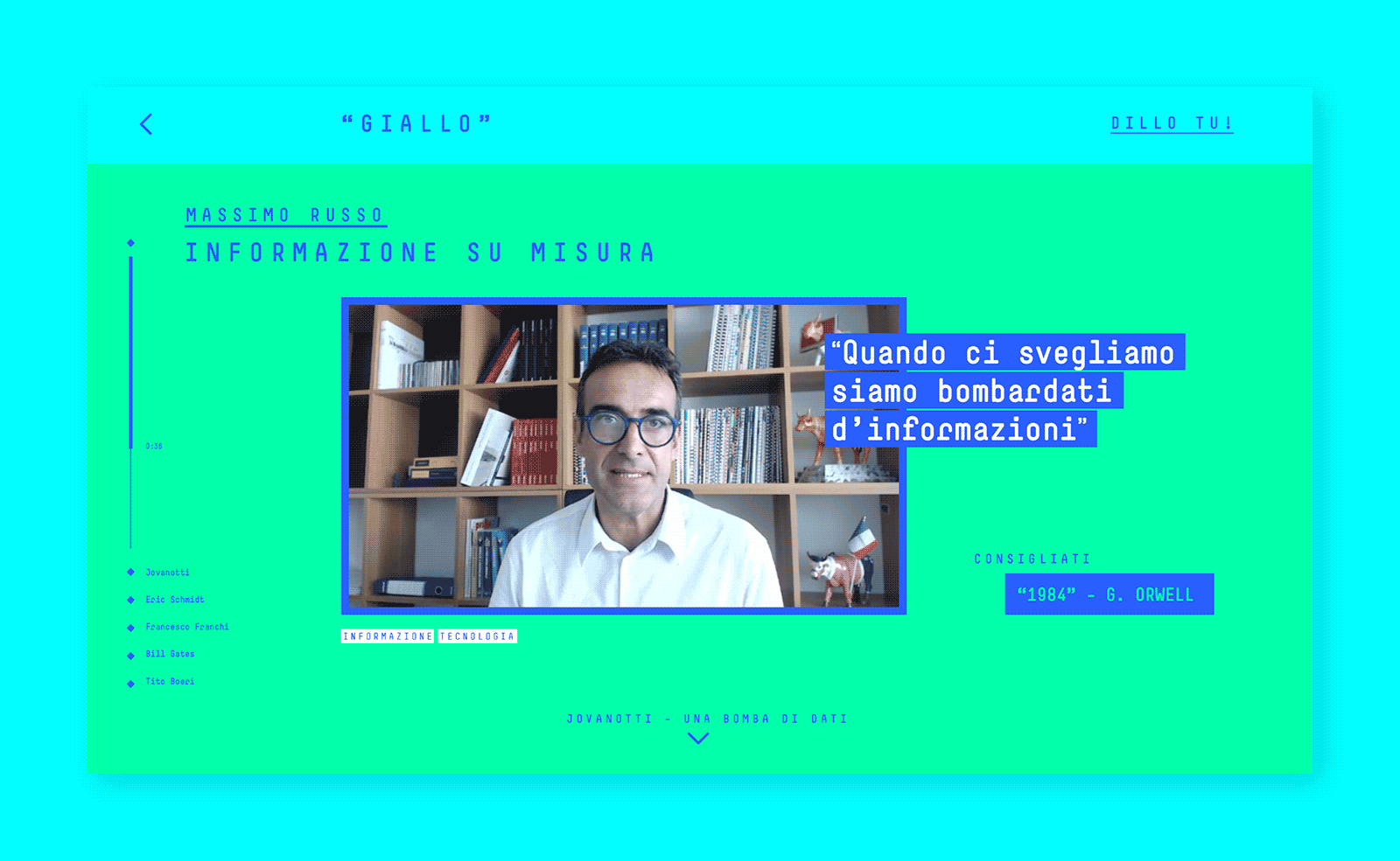
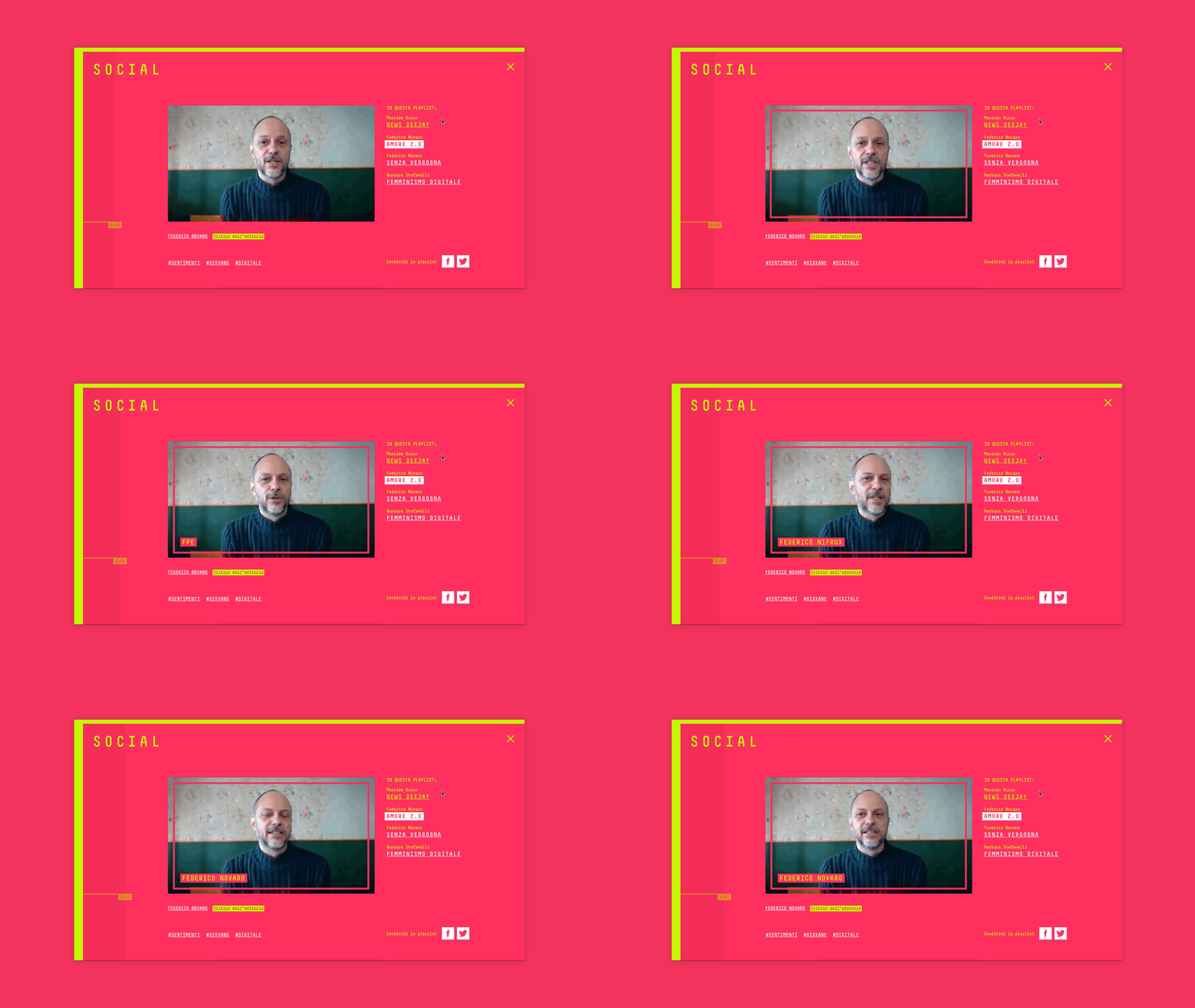
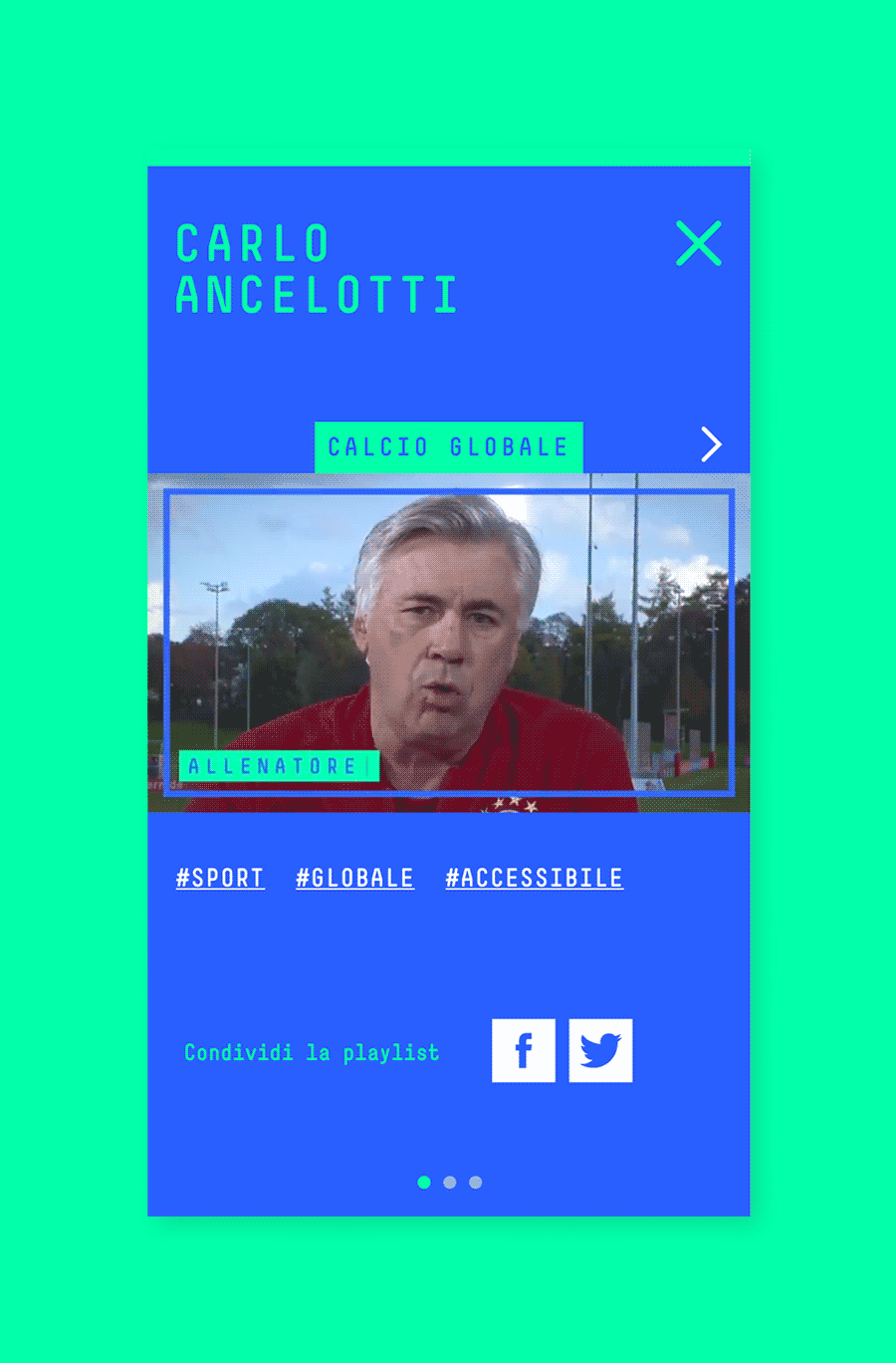
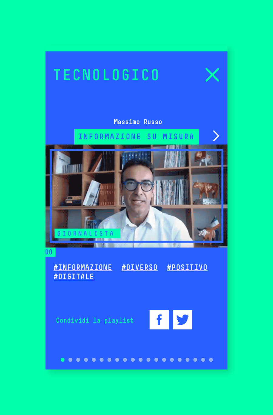
Clicking on a wall item brings up to the video player, which shows all the clips related to the chosen theme or person. A full featured interface allows to navigate through clips by person, theme or even related tags, and to share the playlist.
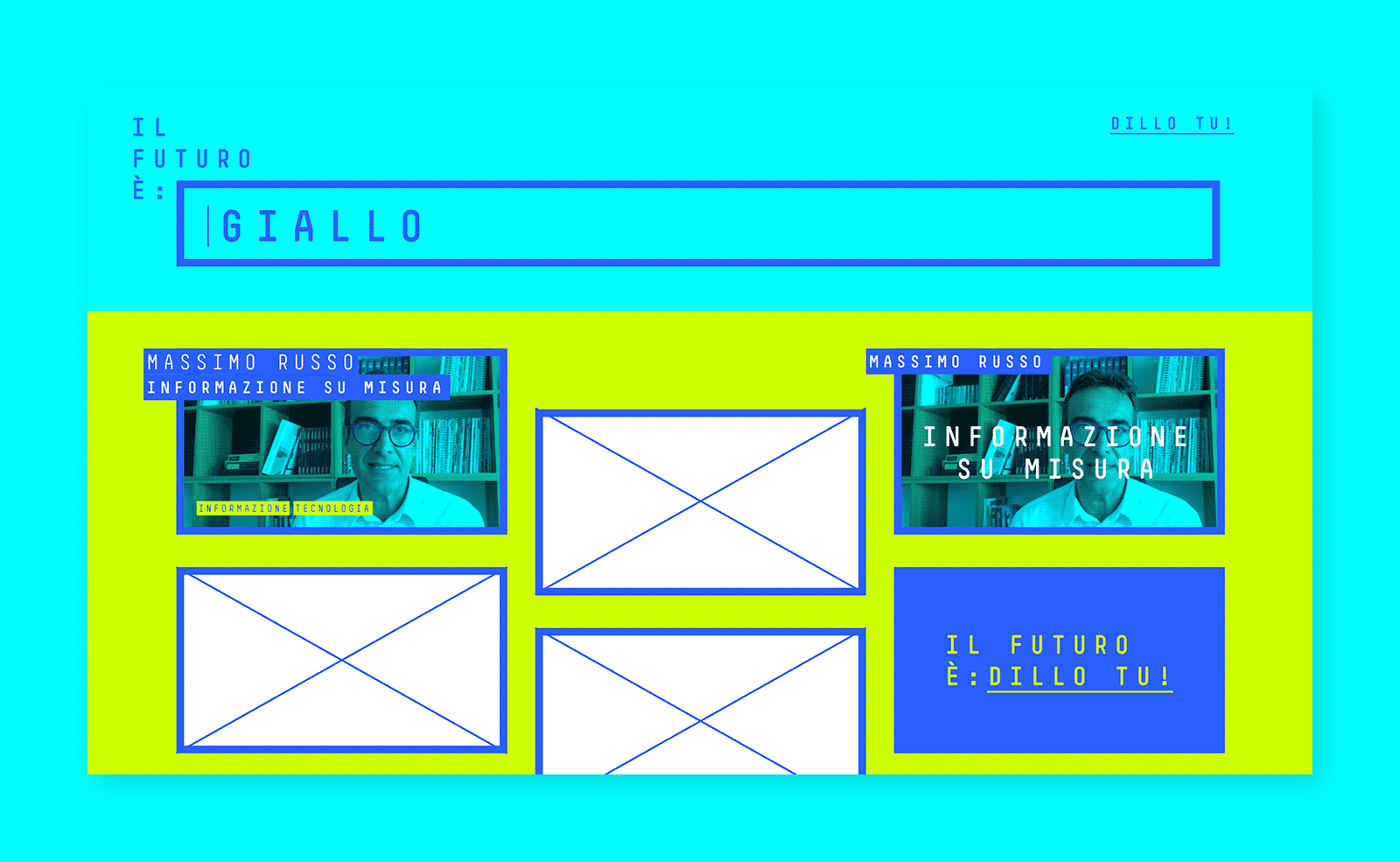
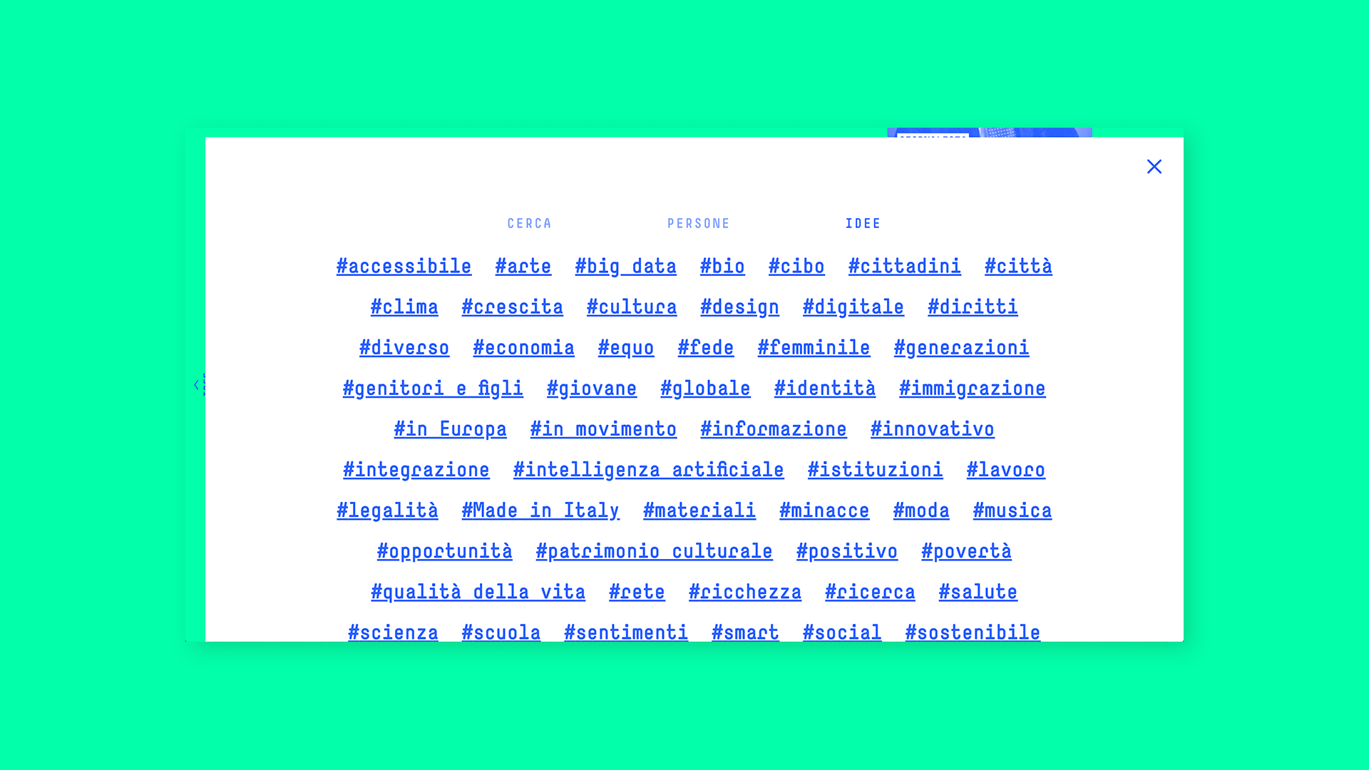
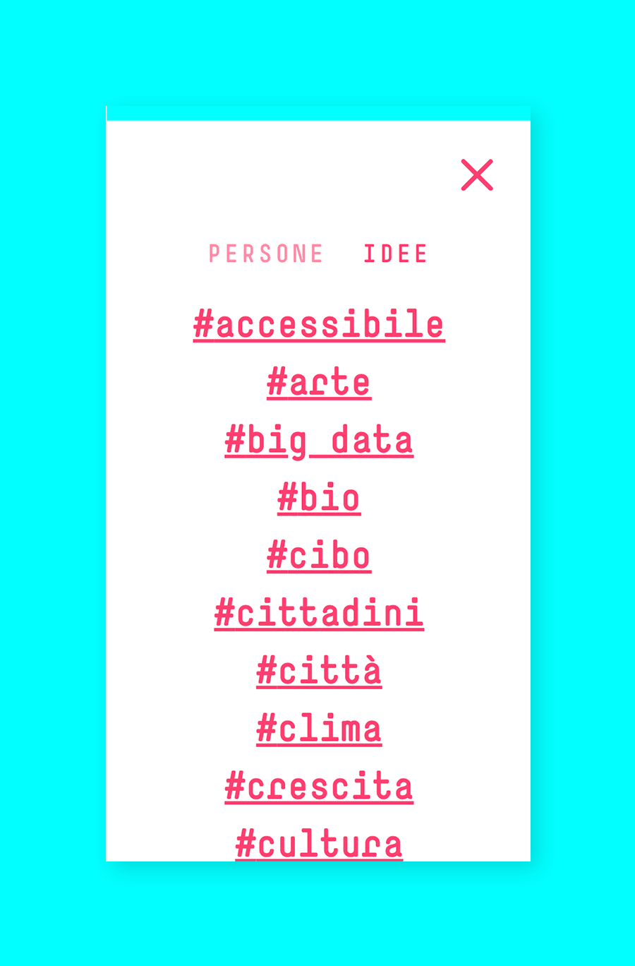
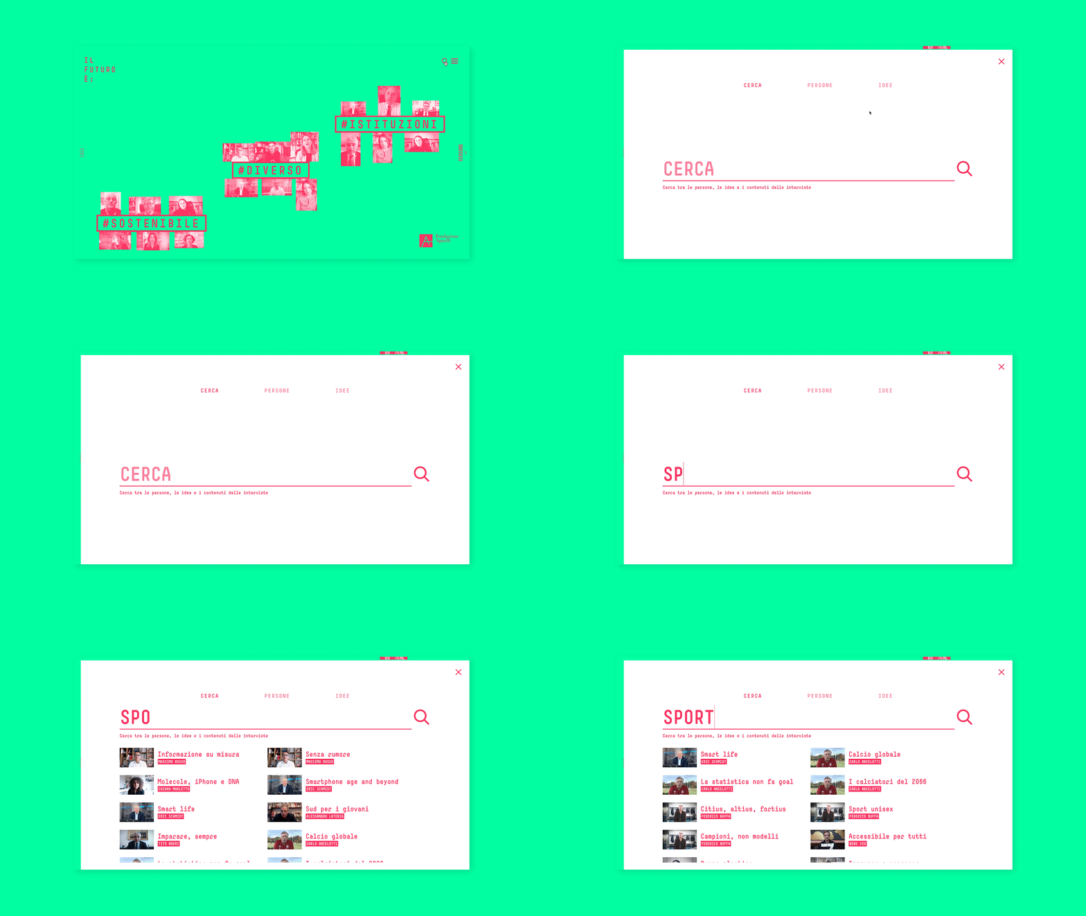
A powerful search tool lets the user view all the persons or all the themes, and enables a full-text search on all the interview transcripts.
Process
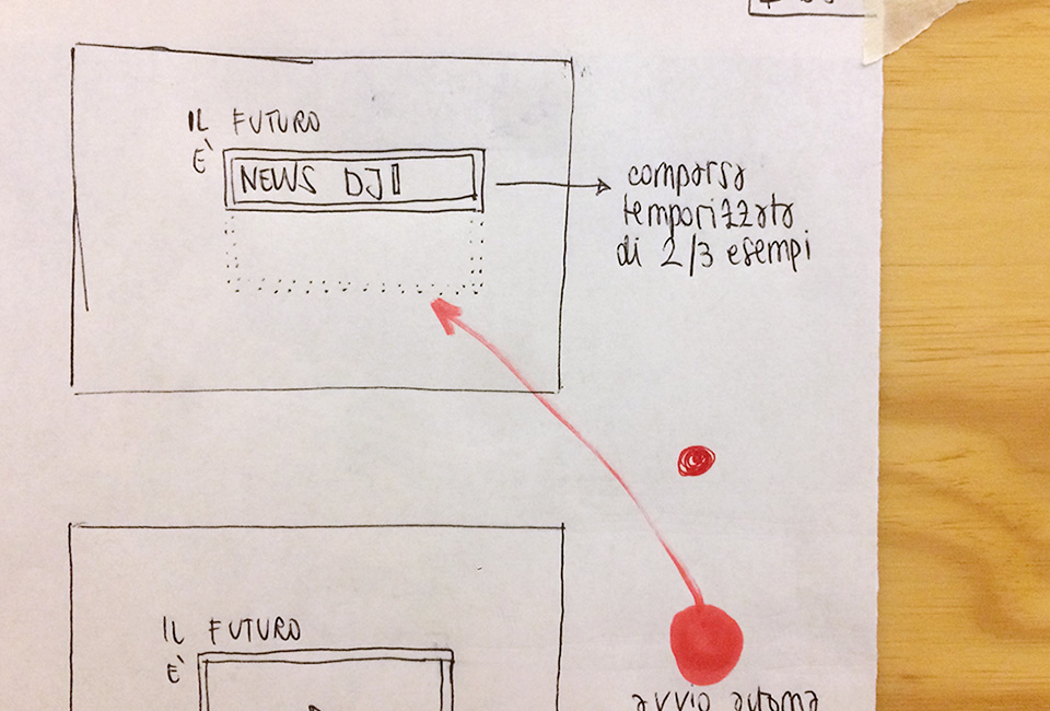
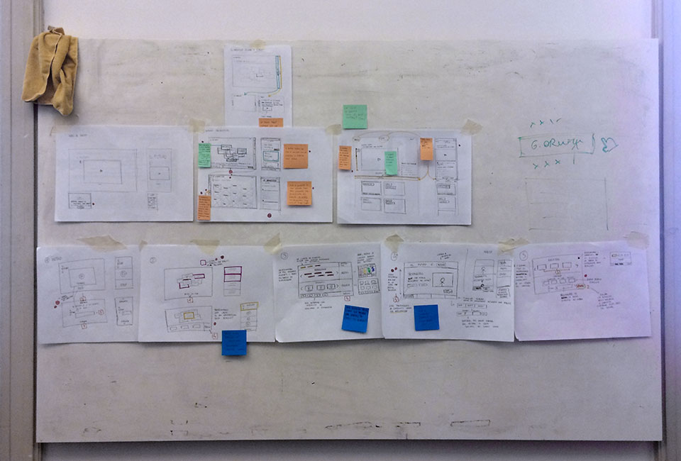
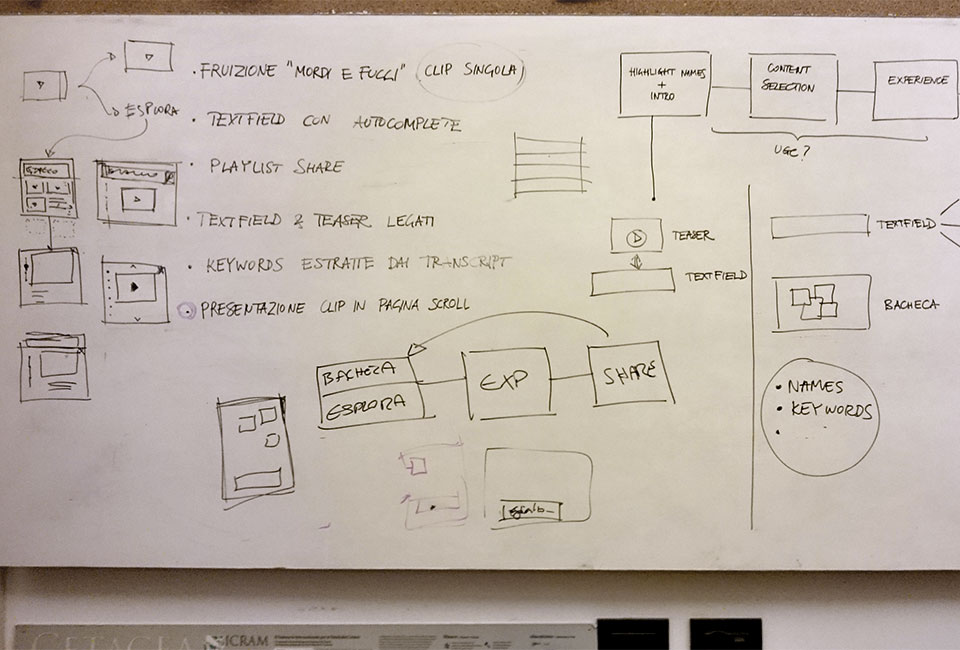
The first step was a full design sprint: a first interactive prototype was implemented and tested, and we undestood that the most difficult features to design were the onboarding and the video choosing step (the solutions implemented in the prototype were not effective for everybody).
Other two testing sessions were conducted during the development of the project: one at the end of the preliminary design phase, one during the development of the website.
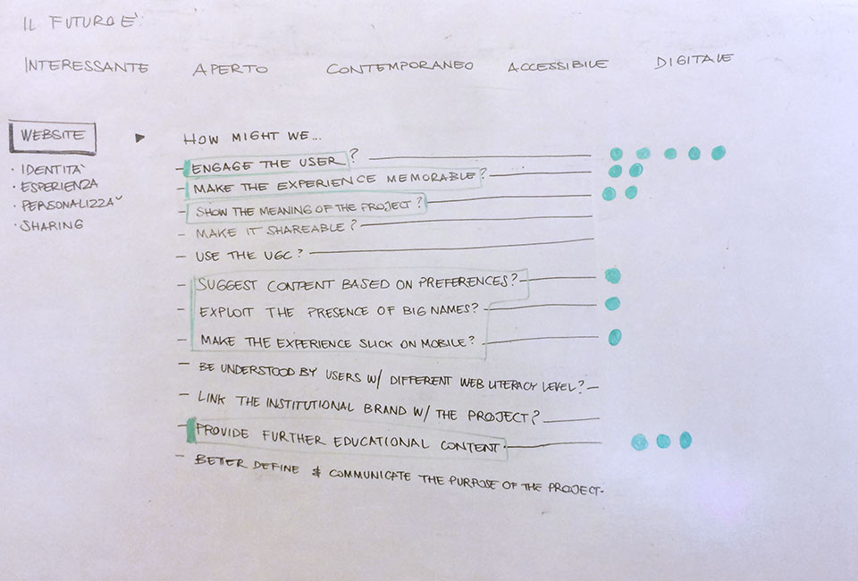
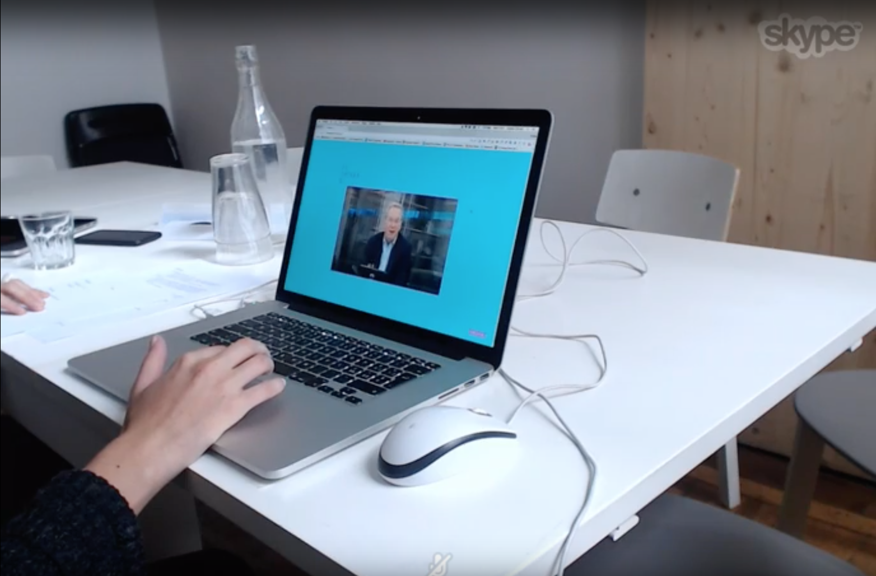
The prototype was tested on 5 target users. A set of tasks was completed and the outcomes (notes, screencasts of the experience, video recordings of the users) carefully analysed.
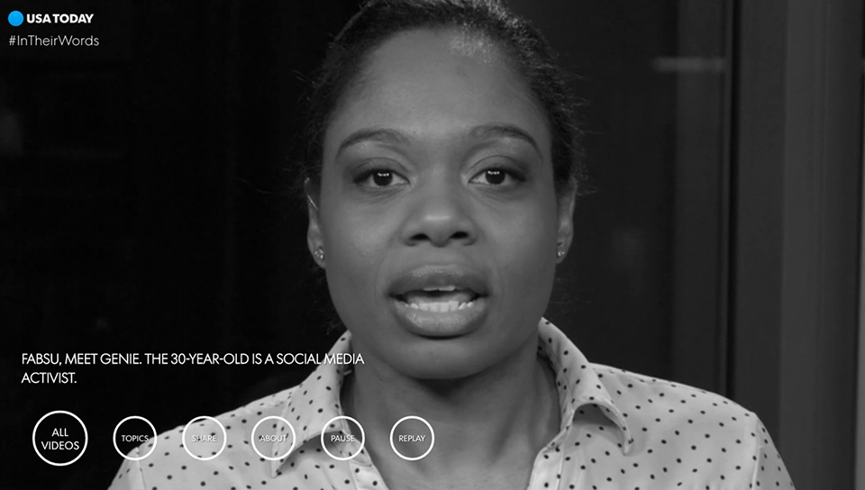
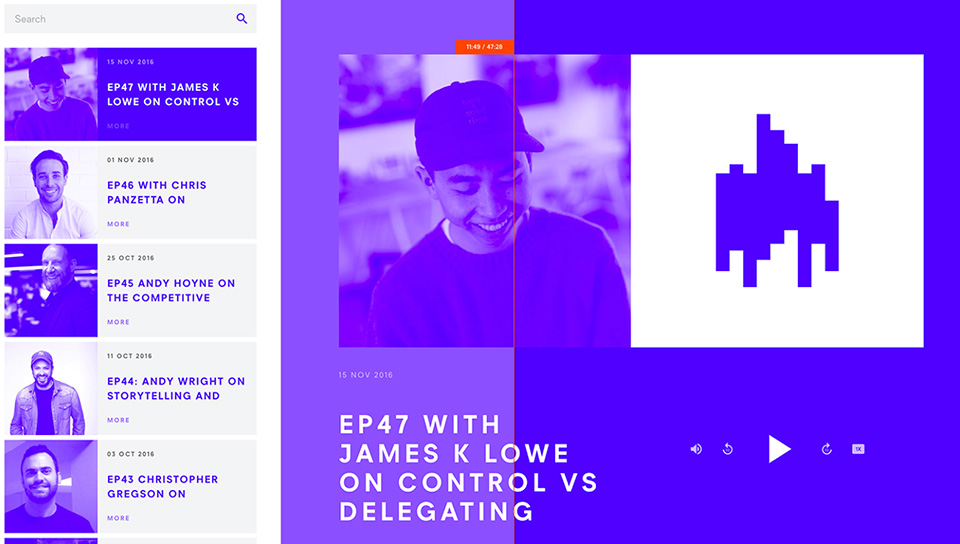
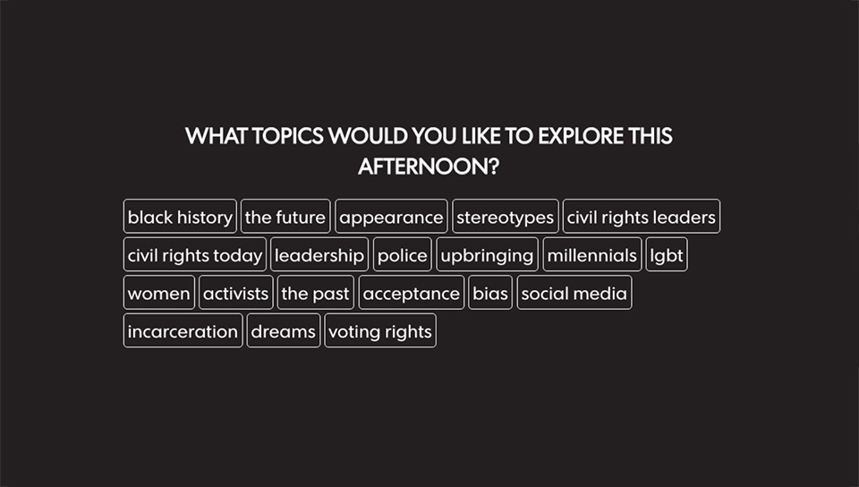
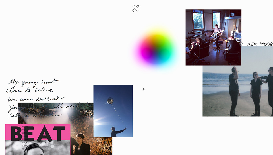
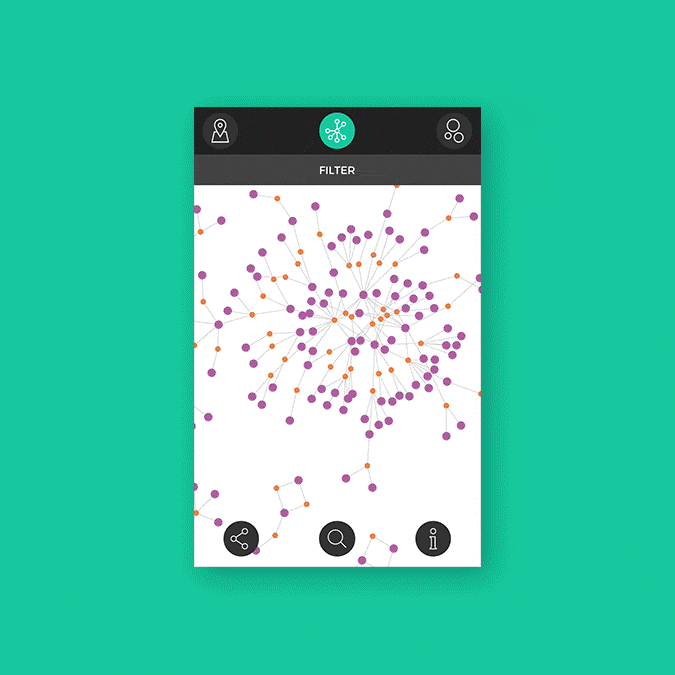
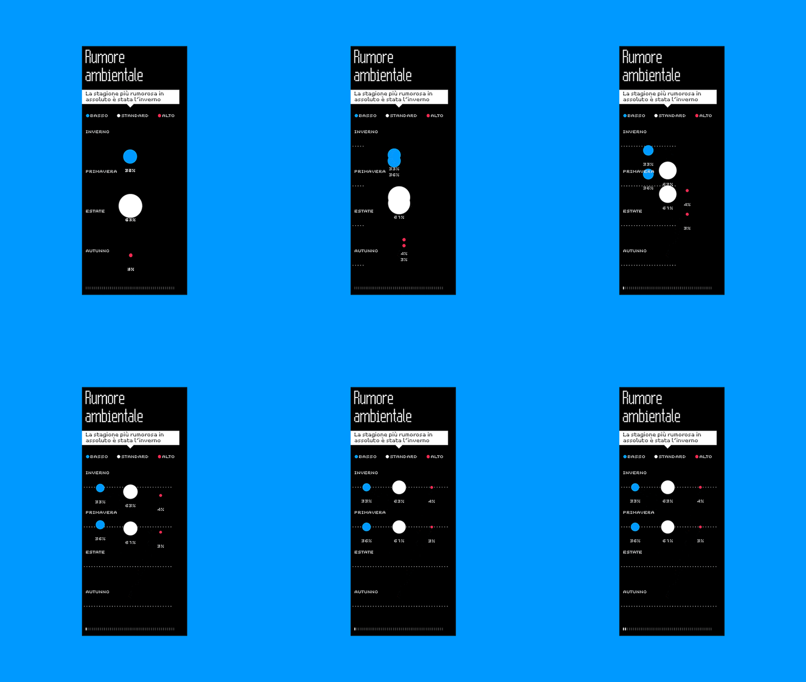
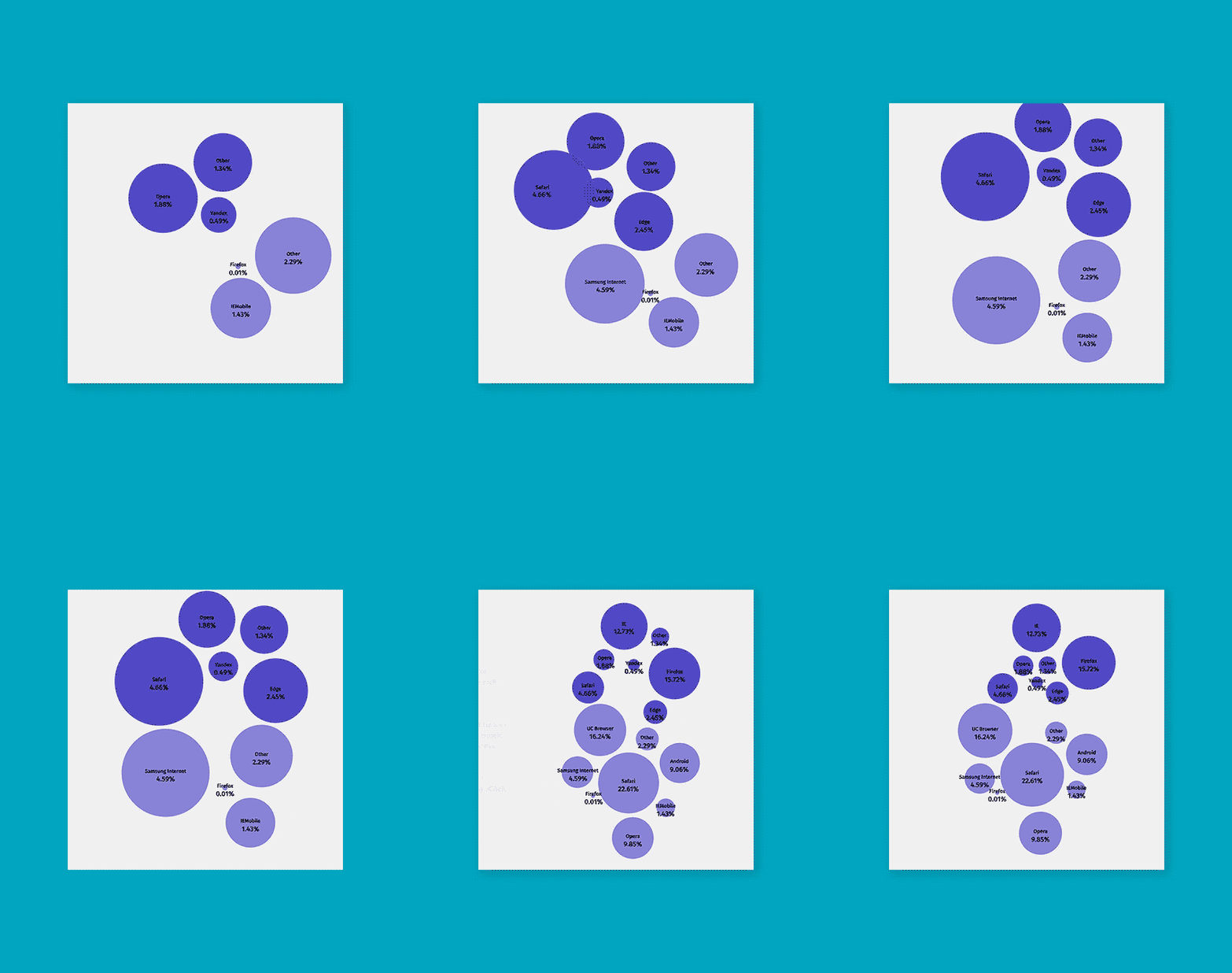
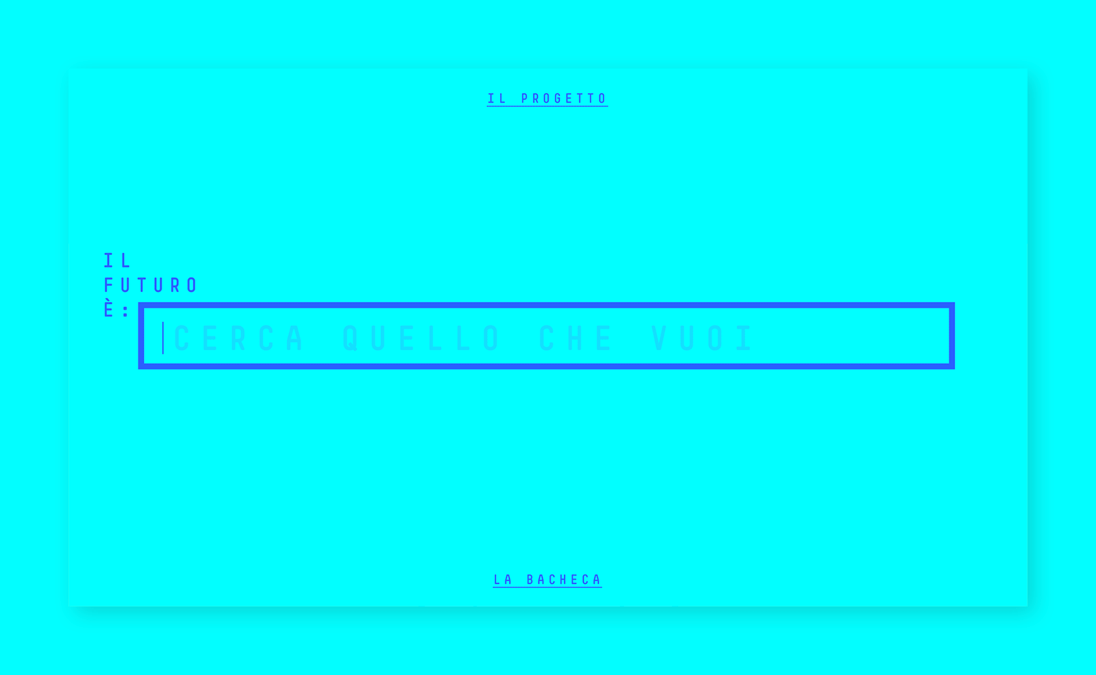
Some screenshots of the first interactive prototype
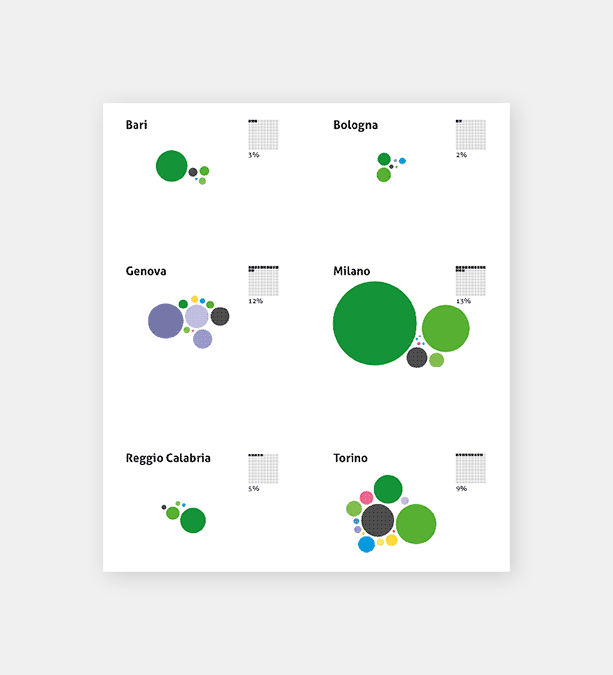
We carried on a massive research about similar projects, design patterns suitable for the project, interaction strategies, user interface elements. Some projects were particularly useful as reference for the experience design, the engaging strategies and the interface solutions.
