Client
Münich Re
Year
2012
Team
Myself
Tasks
Concept, Visual design, Creative coding
Münich Re office walls
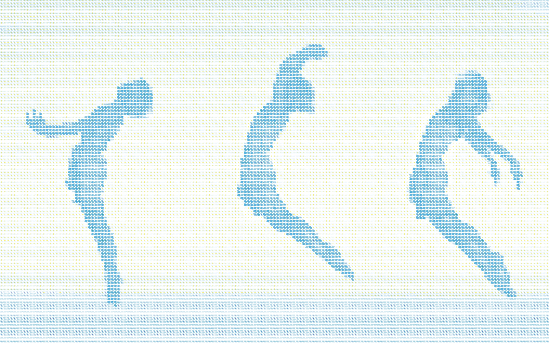
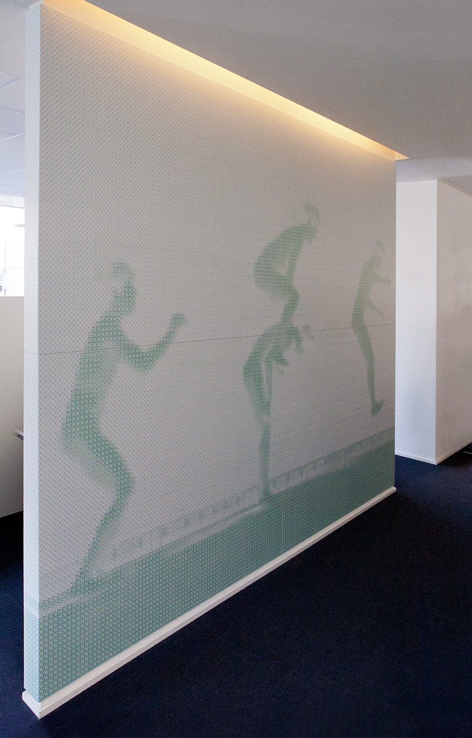
Graphic design of 4 office walls, 340 x 270 cm each one. The technique used was a custom halftone screen effect generated with a self-programmed software code to render images with special patterns.

Goals
The customer needed a visual intervention to beautify the offices in the brand new building. The project goals were:
1. Give the new offices's look a fresh personal touch.
2. Engage the employees towards the main values of the company in an unconventional way.
Solution
I used a visual metaphor to avoid a corny approac to the topic, but at the same time I wanted to be very clear and immediate: this is the reason why I choose to work on the human body language.
To comply with the large size of the artworks, match the modern look of the offices and the company visual identity I worked custom patterns out of the images chosen to represent the values.
Passion, innovation, team working and flexibility are the four company values I had to express with the artworks.
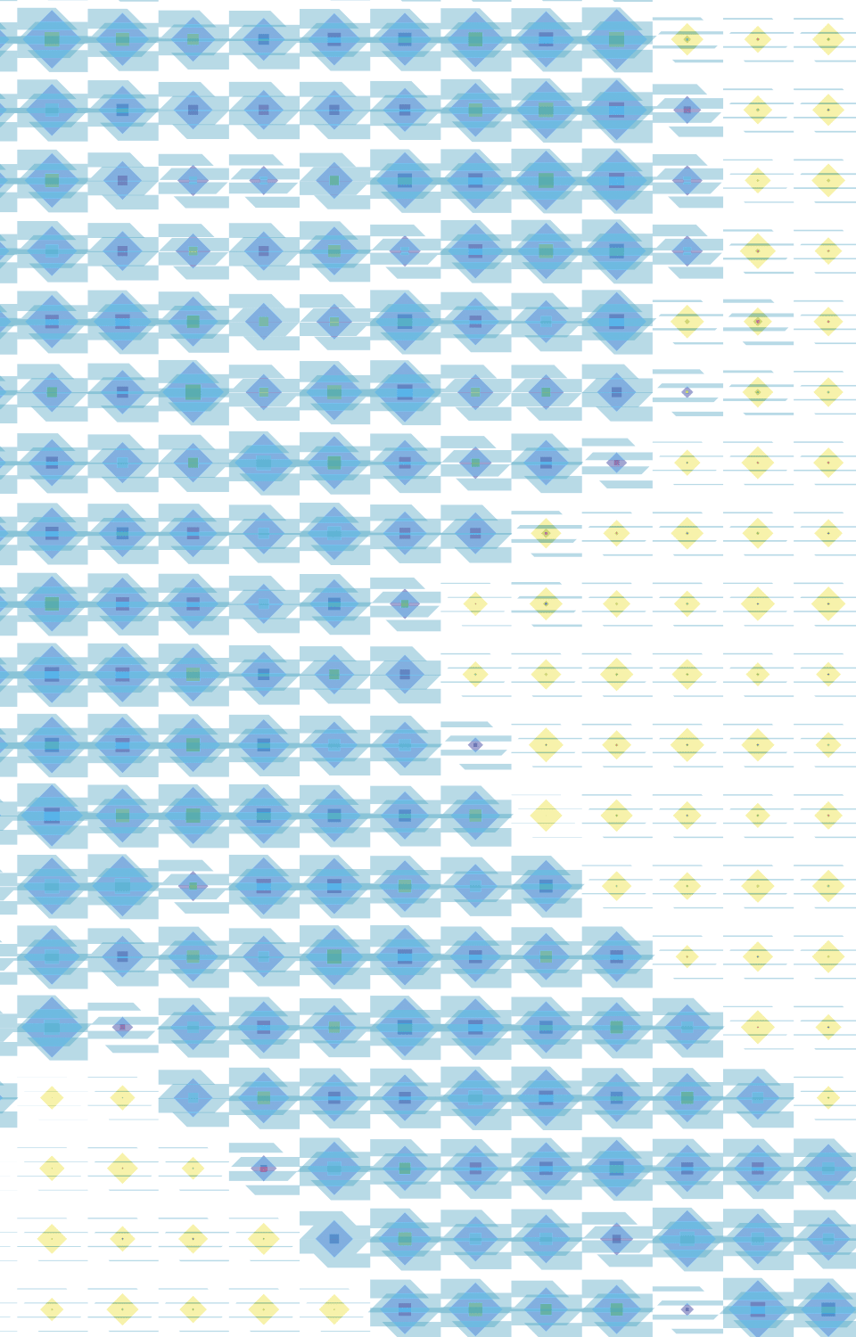
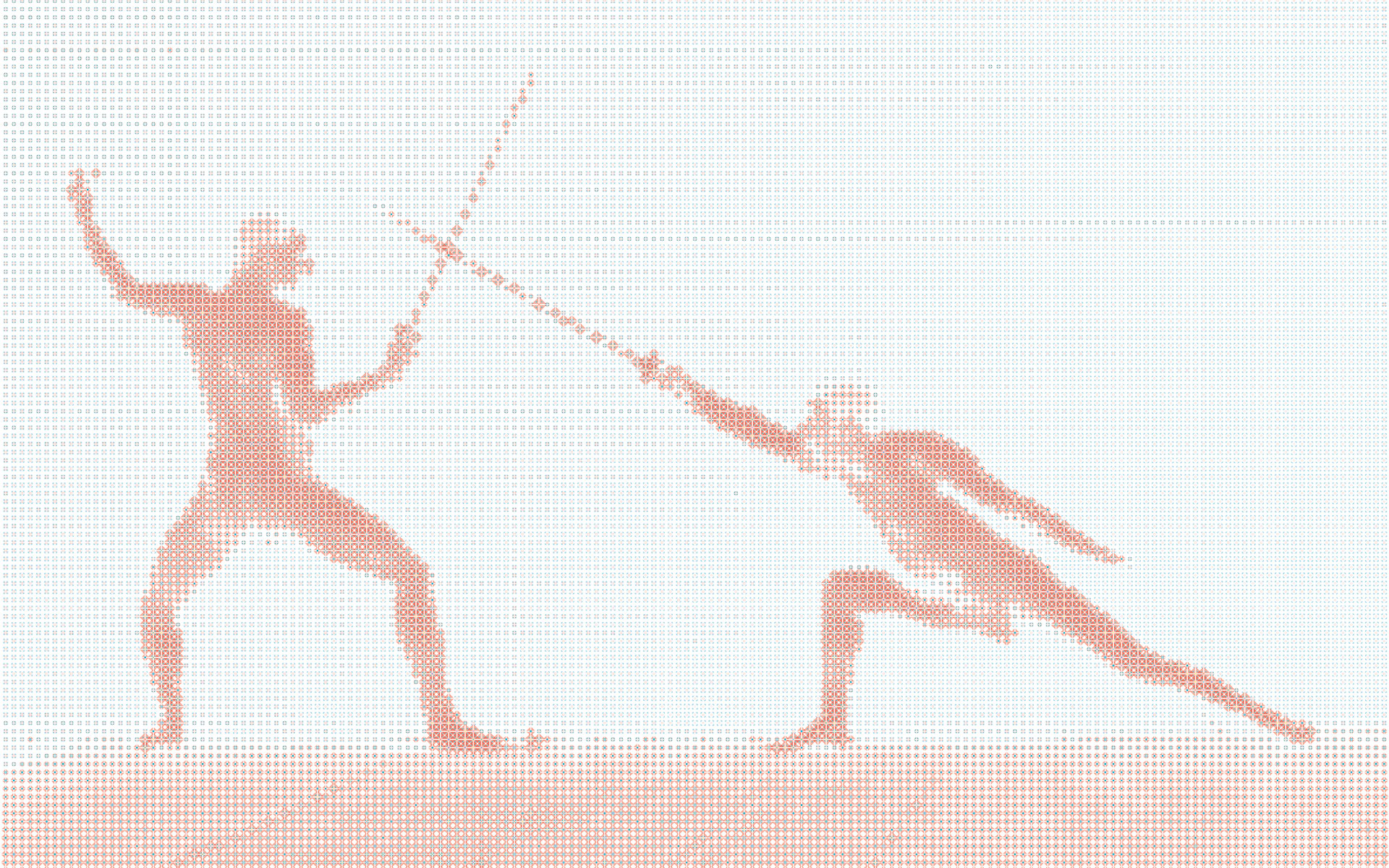
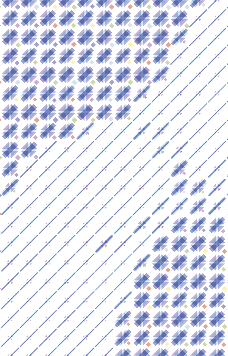
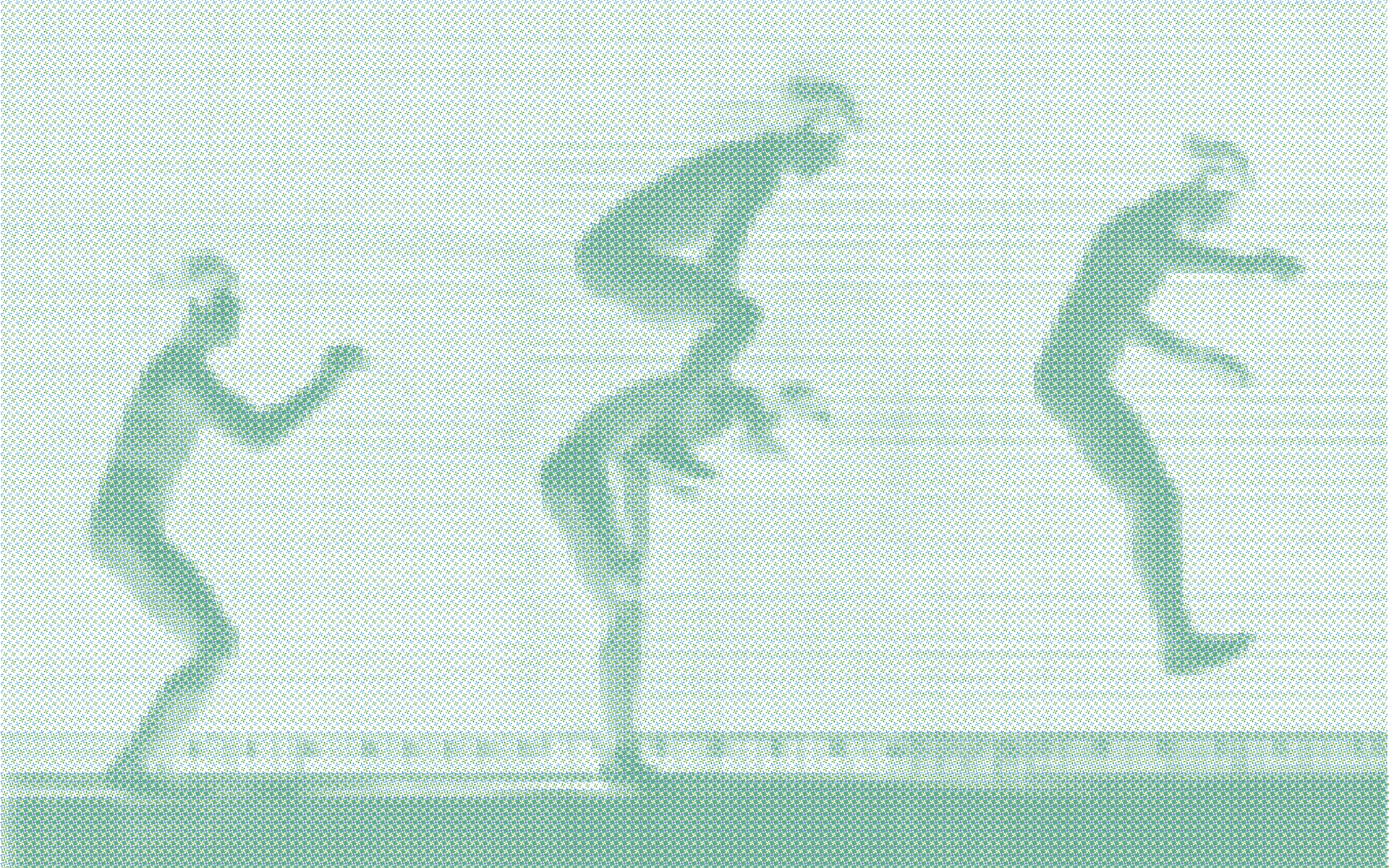
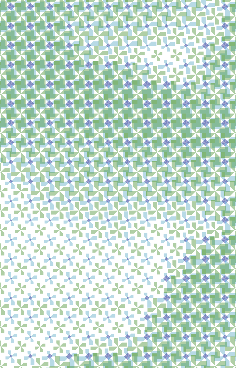
I chose to work on the human body using Eadweard Muybridge’s photo sequences, and processing them with a custom halftone screen effect. To render each photo I superimposed three different semi-transparent layers, each layer with a dedicated colour and tile shape.
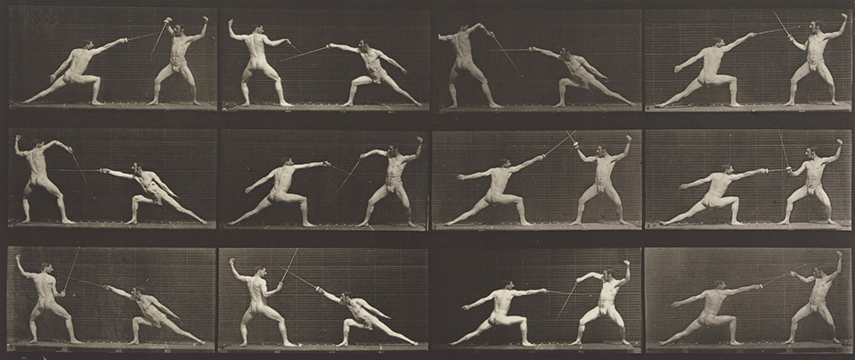
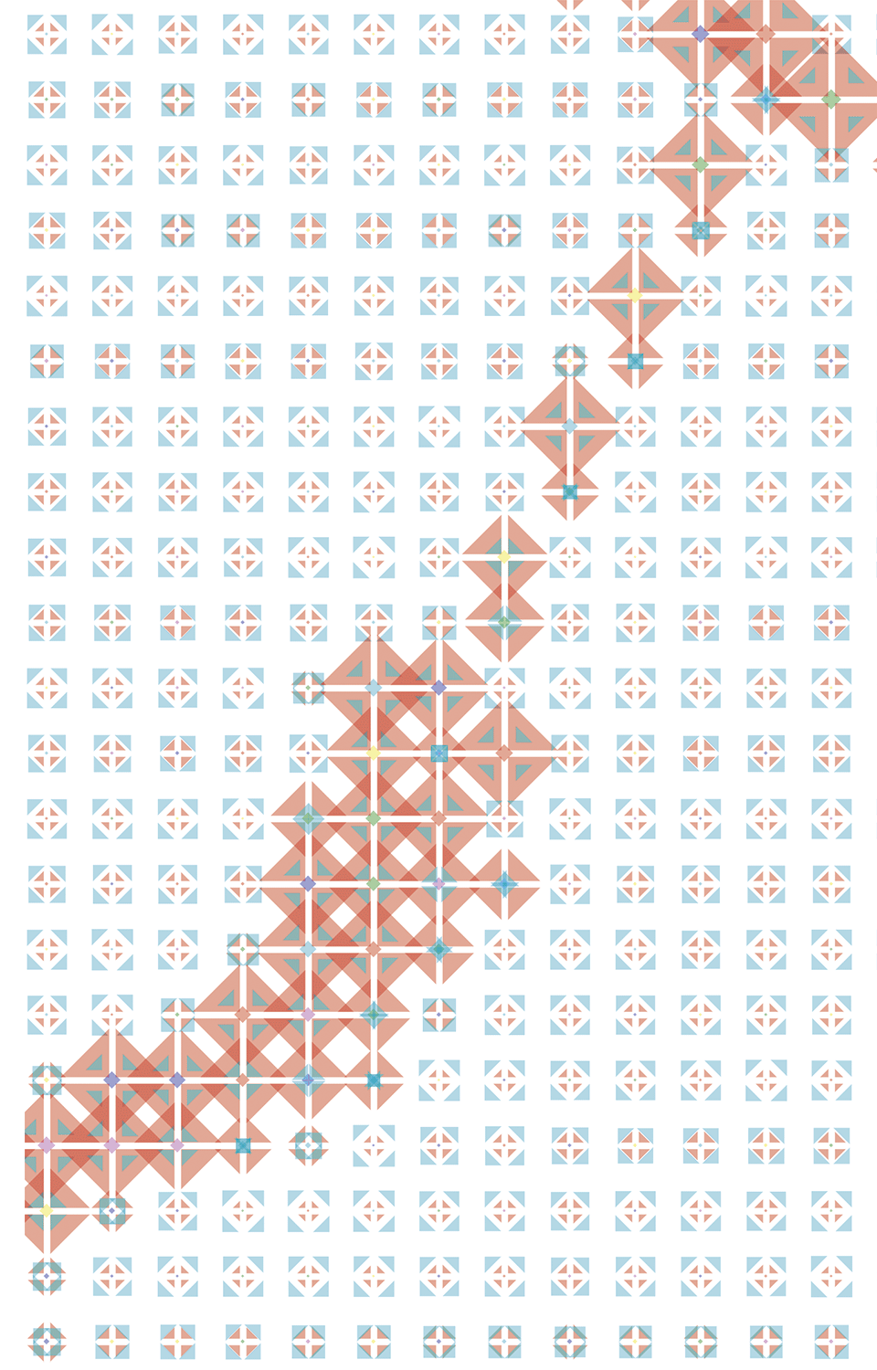
The colours are the primary and secondary RGB @ 40% opacity, while the shapes have been designed ad hoc, inspired by the Münich-Re visual image.
The size of each tile is proportional to the luminosity of the pixel sampled from the original image. Some tiles are composed by more than one shape: in these cases there are topological variations together with size change.
I set up a 2 x 2 cm pattern grid to give the final image an interesting look from both small and long distance. Each graphic is composed by 100.000 to 200.000 different objects: I worked out a program in Processing which generates the whole graphic ready for print.


Passion

Innovation


Team work
Flexibility
